Wednesday, October 9, 2013

Midterm Review 10/9/13 - Feedback

During the midterm review today, I got a lot of helpful and specific feedback on how to move my design forward and create a more functional space.

Dabney Sanders from Action Greensboro on the Greenway liked my idea for shared apartment storage on the 3rd floor of the building,  and encouraged me to provide a communal space for the apartments, which I plan to provide with a roof terrace. She noticed one window in the pharmacy retail space that I plan to fix.

Jo gave me lots of helpful feedback for specific things in my design. She suggested that I add more character and details from my concept to the bike racks on the wall, as well as incorporating some of these details in the lowered ceiling above the pharmacy counter. The lowered area over the pharmacy could also be used for signage or an interesting statement feature. Jo noted that the pharmacy counter needs to be raised to provide a more comfortable height for pharmacists as well as for privacy. The pharmacy counter also needs more of a kick space below. She also said that I need to accentuate the cash wrap in the bike shop more, and lighting will certainly help with that. She spotted door swings that were going the wrong way in my basement egress that I will fix. Jo also noticed that the wood flooring planks were too large in my drawings, which I will scale down for the next deliverables.

I spoke to both Robert Cudd and Todd from the City of Greensboro's inspections department about my plans. They both thought that my stairs, layout, plumbing, and mechanical worked well and that was accessible. Robert told me to think about the material that I will use for the roof in the storage and terrace area as to not be a safety hazard for tripping. He also told me to double check that my apartments meet the maximum travel distance to an exit.

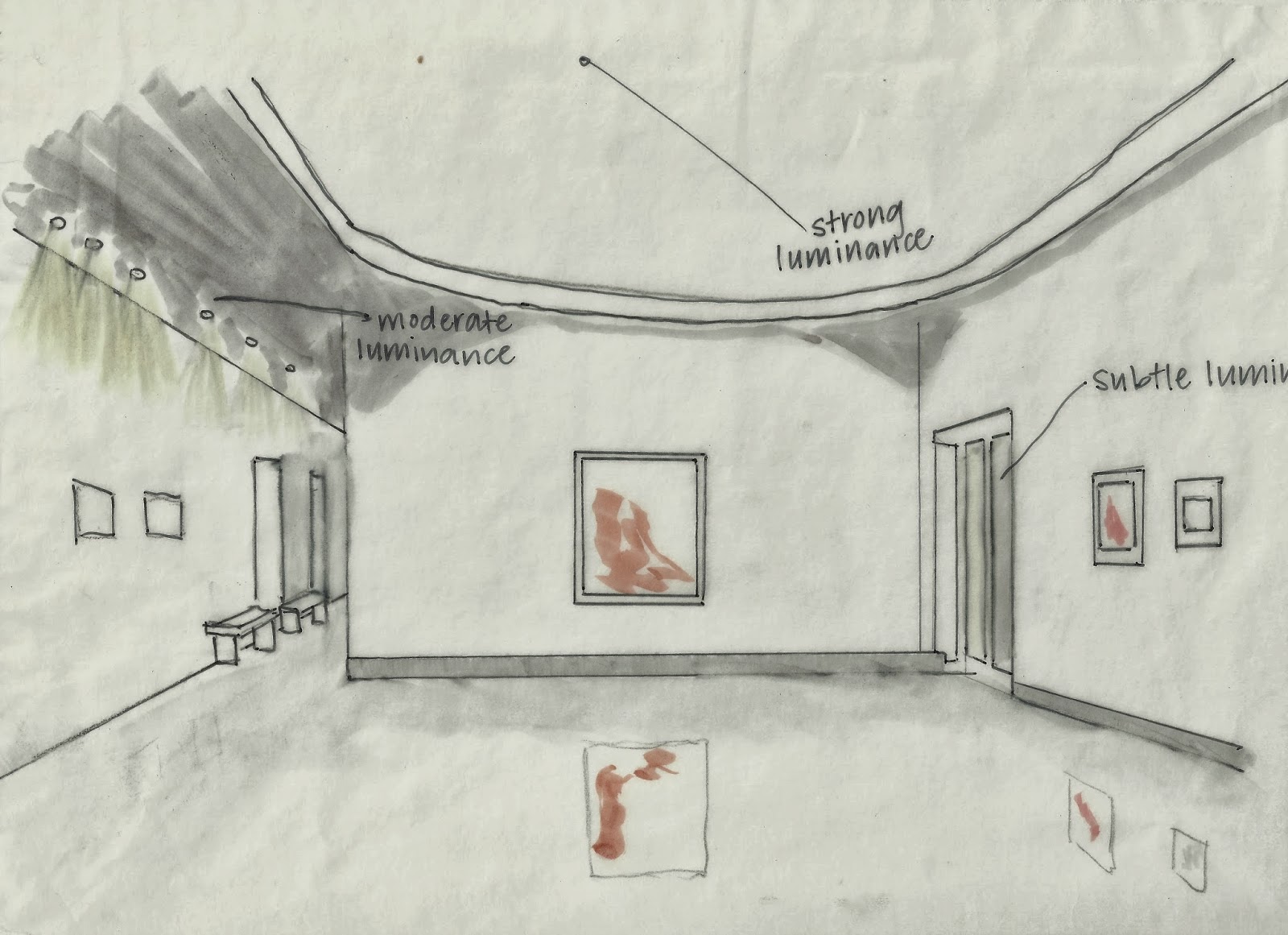
Jerry Leimenstoll encouraged me to think more about how I will use lighting to highlight specific objects in my spaces. He told me to highlight the bikes that I am trying to display while minimizing the overall ambient light to give a more dramatic effect. He told me to go to The Fresh Market in Greensboro to look at the strategies that they use to light items in the space. I also talked to him about the location of my new pulley system in the bike shop for lowering bikes to the basement. He told me to think more about the sense of entry when a user comes into the space and where the ideal location would be to make it accessible to both entrances without being a safety hazard.

Grad student Lauren Postlmayr also gave me some great solutions to floor plan issues. She told me to make the bike shop office smaller so that the area behind the cash wrap can be used for display or another function. She also told me to reduce the length of my shelving in the pharmacy so that it is not directly behind the lunch counter area. This way I could add a table and chairs to the lunch counter area to provide additional seating besides at the counter. Lauren suggested sliding doors for the apartment closets to save space. She also told me to push furniture in the apartments more towards the walls because there is not an adequate path to the windows. She also noted some door locations that needed to be changed a bit to make more usable space.

Peer Reviews:

Chelsea Epes told me that I should poche my section perspective the same color that I poched my floor plans in, which I think would give the presentation a more cohesive look. She also told me to label the rooms in my floor plans which would be helpful to those reading my board.

Anna Hambly enjoyed my bike racks in the bike shop as well as the angled pharmacy counter. She thought that they related well to my concept. She would like to see more detailed views of how they work. She noticed a few corrections on my floor plans such as walls that I need to poche and door swing corrections.

Matt Weikert indicated that I should develop the idea of having communal space on the roof and suggested that I have circulation leading through the storage area. He also threw out the idea of continuing the elevator up to the third floor to give accessibility to the roof and 3rd floor apartment.

Wednesday, October 2, 2013

Sketch Series 4


Illuminance level was taken at a 36" high desk.  Reflectance was measured using an aluminum sheet, and transmittance was measured by the light source passing through paper. 

Sketch Series 3

                                   Fabric 1          Fabric 2          Fabric 3         Fabric 4

I was very surprised at the extent of the color variation of the fabrics under different light sources. The colors of the material varied significantly from light source to light source. You can see how dramatic the changes in color are yourself by looking at each of the columns above and realizing that each column is the same fabric and color in reality. One fabric can range from green to gray to yellow or orange depending on the light source. Overall the colors seemed the most "true" under 5 pm natural daylight- which is the optimal color rendering quality. Colors seemed very red under halogen lights, somewhat orange under fluorescent light, greenish under metal halide lamps, and bluish under LEDs. This shows what hue of light each of the lamps emit. The colors even varied over different times of day in natural daylight, from grayer in the morning to brighter and warmer in the late afternoon. 

Tuesday, October 1, 2013

Sketch Series 2


My first sketch was taken from Kiosco Mexican Grill on Spring Garden Street. Kiosco used incandescent lighting via recessed lamps to achieve strong ambient lighting as well as incandescent pendant lighting for task lighting at the bar. Overall, the lighting was fairly strong and glary, and the amount of lighting was a bit overwhelming for the space. I believe the restaurant could achieve a much more pleasant and intimate atmosphere by scaling back the number of lights or dimming the lights to make them less harsh. Subtle lighting came from two TVs, which did not provide significant lighting or obstruct the existing lighting scheme. Lighting was fairly even across this portion of the restaurant, and strong shadows were cast throughout from furniture and some shelving. Patterns of light could be more effective by again scaling back the number of lamps and concentrating more on lighting specific areas such as individual tables. This atmosphere serves waiters and staff well because the bar and circulation paths are lit very brightly, but the experience for diners could be improved with softer, more intimate lighting in the dining areas. 


My next sketch was from the Barnes & Noble bookstore at UNCG. Most of the lighting in this particular area came from bright natural light from windows to the outside. Bright afternoon light came flooding into the space and blanketed the books and shelving. There were areas that had a certain amount of glare due to more reflective materials. Overhead fluorescent lighting constituted the secondary source of light and main artificial light in the space. This lighting was staggered and evenly distributed throughout the store. This made a big difference towards the back of the store where natural light was not as abundant, and did a good job of illuminating the merchandise without causing glare. More subtle illumination came from recessed halogen lights in small built-in shelving areas around the perimeter of the store These were effective in highlighting posters and books that were being promoted by Barnes & Noble. The lighting in the space, especially the natural light, caused dramatic light and shadow patterns in the edge of the store and created a bright and interesting space to browse in. Glare could be minimized in a few areas by using less reflective materials. Overall, the space is effective for reading and shopping, and provides a connection to the outside that doubles as a way to entice potential shoppers to come into the store. 


My last sketch was in the Weatherspoon Art Museum at UNCG. This space is very dramatically illuminated by a large clerestory many feet above the main open gallery area. Natural light floods into the space and illuminates the artwork and creates interesting shadows under the curved portion of the ceiling. Secondary lighting comes from recessed halogen lights in a corridor that leads to other galleries. This lighting is effective because it does not distract from the dramatic natural lighting effect, yet provides adequate lighting to travel along the corridor. More patterns of light and shadow could be introduced in the corridor to mirror the large clerestory in the main space. More subtle light comes in through the doors that lead to the outdoor courtyard, and inform the visitor that there is more to the museum outside. A highly polished concrete floor reflects the artwork displayed but does not cause glare due to natural light being used to light the space from a distance. This is a nice alternative to artificial gallery lights which may distort the colors in the paintings, and gives the visitor substantial yet unobstructive light by which to view the artwork.