Monday, November 28, 2011

Cabinet of Curiosities

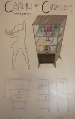
For our final project for the semester, we were asked to design a "cabinet of curiosities" that would house 3 objects that the first years created...


Upon meeting with first years Tarek Baassiri, David Kendall, and Torrey Orlopp, I got a clear understanding of what function my cabinet needed to meet. Tarek had designed a CD holder, David designed an iPod, and Torrey designed a holder for a Led Zeppelin concert ticket; so it was clear to me that the cabinet should revolve around music, both functionally and aesthetically.  I knew I wanted my cabinet to have a speaker so it would function as a way to both play and store music, and David proposed an amazing lighting idea to include music-synching LED lights that would pulsate with whatever music is being played.  With these two ideas in mind, I explored different forms to house the objects.
When I began thinking about music-related forms, I came up with several ideas for a cabinet, which included a boombox, amps, a gramophone, and a jukebox. Although each of these cabinet ideas related to the three objects that would be stored inside, I believed that they were too literal and didn’t fit the exact style I was going for.  Going back to the drawing board, I kept the Led Zeppelin ticket holder in mind specifically as to give me a clue for the feel of the cabinet. I decided that a retro, late 1960’s inspired cabinet would fit the objects well and by researching furniture from this decade, I arrived at my final design.
I came across the final shape of my cabinet through a spur of the moment sketch in class after looking at retro furniture online. I wanted something that was funky and rock-inspired, and the tapered pyramid-like design of the cabinet entered my mind as an edgy, retro design. The cabinet includes a speaker at the base, held on angular, tapered legs, which would play music from the CD rack on the first shelf and from the iPod dock on the middle shelf.  Colored LEDs would be installed under the top panel of the cabinet and on top of the speaker. Glass shelves would allow the light to pass through the entire cabinet, creating its own light show whenever music is being played. The side panels and front cabinet doors would also be glass in order to showcase the objects inside. The bottom shelf holding the concert ticket would be the only section of the cabinet with doors, in order to preserve the condition of the ticket as well as signifying a place of display and importance. The door pulls on the cabinet were taken from a symbol on a Led Zeppelin album, which draw attention to an important object as well as add a fluid element to an otherwise linear cabinet. On the second shelf is an iPod dock built into the shelf which houses David’s iPod. This was placed on an open shelf at a height that would be easiest to access, because this would most likely be the most used object in this cabinet. On the top shelf is Tarek’s CD display, which is fixed onto a lazy susan spinning mechanism in the shelf that would allow the user ease of selecting a disc from any side of the polygonal rack.
I decided to use a dark gray-stained walnut in the cabinet to contribute to the dark, edgy feel of the design. Wood will only be used on the top and back panels of the cabinet and around the speaker in order to hide the electrical components and visually anchor the cabinet. I also chose walnut because of its pronounced grain, which adds a warm, less industrial feel to the cabinet. The door pulls would be molded from recycled aluminum and the glass panels would be held together using aluminum panel fasteners, which is both sustainable and has a modern appearance which complements the retro feel of the cabinet.
I would expect this cabinet to be used in a lounge, bar, or living room setting as a beautiful cabinet by day and party DJ by night. It functions as an entertainment center with a built in conversation piece and memorabilia display for a proud Led Zeppelin fan. This cabinet would allow users the freedom to easily access all of their music in one place, while having a unique lighting experience to accompany each song.  It is a rock and roll cabinet of curiosity! 

Thursday, November 17, 2011

Quilling

I was on stumble upon and I discovered quilling which is "the art of turning paper strips into intricate artworks".  They are so beautiful and reminded me of when we had to use paper to create a place for a leaf in first year studio. If only I had seen these then!


Wednesday, November 16, 2011

Music Synching LEDs


Idea to apply to lighting on the inside of my cabinet of curiosity: lights that flash with the music being played inside it!

Sunday, November 13, 2011

Signage Precedents

http://www.apcosigns.com/infolock.asp

This example is the "info lock" system from APCO Signs. The idea is that there are several interchangeable tabs behind a hospital sign that allow doctors and nurses to display information regarding the patient. There is a security button under the sign which allows only authorized personnel to change the information. Even the background of the sign and the finishes can be changed. I thought that this sign was brilliant because it an easy to understand system and it is more efficient and better looking than just posting these pieces of information on the door via paper or whiteboard. 

http://www.window.state.tx.us/specialrpt/tif/southtexas/healthcare.html

This example of architectural signage is from the Edinburgh Children's Hospital. The main sign displaying the name of the hospital is spelled out using building blocks and this theme is continued with block-like sections covering the entire facade, with whimsical animal images on each one. I liked this use of signage because it makes children feel less scared to go to a hospital when the exterior is friendly and playful. 

http://customsignsdenver.com/products-services/glass-signage-donor-walls/

I find glass signs inspiring because light can pass through, reflections draw your eye to them, and they usually are very clean-lined and modern looking. A glass signage system would give a business an overall sophisticated feel.

Friday, November 11, 2011

Inspirational Quote of the Day

‎"When I was 5 years old my mother always told me that happiness was the key to life. When I went to school, They asked me what I wanted to be when I grew up. I wrote down 'happy'. They told me I didn't understand the assignment, and I told them they didn't understand life." -John Lennon


This quote stuck a chord with me today. It is always important to find happiness in everything you do, and it makes my happy to be in a program where I can explore my creativity every day. Life is short, live!

IOB...we made it!

Today we presented our finalized design to Richard, Naari, board members, and the other workers from the IOB and it was a success! I felt very happy with our final product and I'm hoping this design will be something that will be put into action at the IOB. This project was a life changing experience not only because this was my first "real life" design project but because we got to help some really special people who appreciate our work.

Here's some pictures from our pin up today:


Wednesday, October 26, 2011

Marina Bay Sands Hotel - Singapore

Okay, I'm probably posting this because I need a vacation and I'm also a dreamer, but I thought this Hotel was amazing. The Marina Bay Sands Hotel in Singapore has three giant towers with a "sky park" cantilevered atop of them. The sky park features an infinity pool that is the world's largest outdoor pool at its height. The breathtaking view is to die for!


Interesting Lighting

Continuing the theme of our blog assignment, I decided to post some cool images I found of interesting lighting designs.

"Huggable" Lighting


Backlit wallpaper


"Moonstruck" lighting perforated from porcelain


http://www.tripadvisor.com/Restaurant_Review-g33389-d1015782-Reviews-Red_Mountain_Grill-Dillon_Colorado.html
http://www.geekologie.com/2007/10/lightemitting_wallpaper_is_coo.php
http://www.getmarried.com/wedding-blog/2009/06/01/weddingceremony-location-and-decorations/
http://homedesigninterior.com/2011/02/10/d°-light-huggable-cool-lighting-inspiration-for/
http://www.squidoo.com/cool-lights

Blog Post 005: Lighting in the IOB

Talking with lighting designer Scott Richardson last friday helped out group come up with lots of lighting ideas for the Industries of the Blind. One main point he made was making it easier on older eyes, eyes with visual impairments, and even young eyes with great vision by decreasing glare. He suggested we do this by decreasing the difference in inside light and outside light while entering the space by creating a transition that allows the eyes to adjust to different light. We discussed the harsh, hospital-like florescent lighting that is currently in the space and he advised us to look at different kinds of florescent lighting that isn't so harsh. Upon Scott seeing our hexagonal graphic, we discussed backlighting with him as a way to highlight the shapes as well as creating interesting shadows to continue patterns on the floor, walls, and ceiling. He saw our triangular overhang idea as a good opportunity to diffuse light using a translucent material. I also believe that spotlighting should be used when we incorporate a timeline into our hexagon graphic in order to draw attention to the information that Richard and Dave LoPresti wanted to be displayed.

Monday, October 24, 2011

Instructional Compositions


IKEA generally has very successful instructions that come with their home assembly products. In the composition above, IKEA uses simple, easy to understand illustrations along with humor to show how to  assemble their products in a user-friendly manner. 

I thought that this origami instruction composition was successful because it gives a clear order of how to fold the origami by using numbering and a path graphic leading up to the final product. The color also ties the composition together. 

Thursday, October 20, 2011

Candice Olson

Candice Olson is probably the only designer on HGTV whom I agree with almost all of the time. Her designs truly are "divine" as the name of her show "Divine Design" suggests. It is my aspiration to one day be like her. I am in love with her classic, elegant style.


http://kravet.typepad.com/inspiredtalk/candice-olson/
http://meganleiter.wordpress.com/2011/05/05/designer-spotlight-candice-olson/
http://paintbyjosie.blogspot.com/2011/06/metallic-wallpaper.html
http://blog.ashleycampbell.com/2011/05/04/inside-the-mind-of-candice-olson/

What's Running Through My Head

I thought I would commemorate my 100th blog post with some of the songs that provide a soundtrack, inspiration and life while working on assignments. Here's a few faves:

Melt My Heart to Stone--ADELE
Tears Dry On Their Own--Amy Winehouse
Happy Days Are Here Again--Barbara Streisand & Judy Garland
Because--The Beatles
Magic--Ben Folds Five
Three Little Birds--Bob Marley
Fast Car (feat. Kina Grannis)--Boyce Avenue
The Scientist--Coldplay
Courtship Dating--Crystal Castles
The General--Dispatch
Dreams--Fleetwood Mac
Handlebars--Flobots
Details In The Fabric--Jason Mraz Feat. James Morrison
Cathedrals--Jump Little Children
Time To Pretend--MGMT
Love Today--Mika
Wagon Wheel--Old Crow Medicine Show
Sleepy Head--Passion Pit
Little Secrets--Passion Pit
Two Princes--Spin Doctors

Thursday, October 13, 2011

Karim Rashid

http://www.speakersbulgaria.com/wp-content/uploads/2010/03/karim_rashid.jpg

Karim Rashid is one of my favorite designers. I love his playful use of color and materials in all of his designs. His website is just as fun to explore as his designs are to view. 

Rainbow-Inspired Architecture

Emmanuelle Moureaux Architecture designed the Shugamo Shinkin Bank in Shimura, Japan, inspired by a rainbow. I liked the built in lighting effects and the use of bold color against a white backdrop. The skylights on the second floor are encased by glass, continuing down to the first floor. This dramatic use of scale enhances user experience.


Photoshop Compositions

For this composition, I first placed all of my images as different layers and scaled all of my images to the desired size. I then experimented with moving the images around until I decided on a layout. I used the text tool to title my composition and the line tool to create the "violin strings" as a border that I liked from my original composition. 

In this composition, I used the same process to scale and place my images, but decided on a different layout. I used the eyedropper tool to highlight the orange accent color in my perspective for the text and the lines. I decided on a more appropriate font for my violin concept that was more visually interesting. 

In my third composition, I scaled and placed my images in a way that gives more hierarchy to my perspective, by having my sections and plan to the right and my perspective framed by the border. I used the eyedropper tool to highlight my violin brown to use in my title and border. I kept the same script font from my second composition because I thought it was successful in conveying my concept.

Wednesday, October 12, 2011

Blog Post 004: Principles and Elements of Design


Rhythm: 
Rhythm is clearly present with the repeating geometric shapes we have explored. Rhythm is seen in the "triangle tree" trellis idea and the hexagonal shapes comprised of smaller triangles. We also explored rhythm with repeating square, circle and diamond shapes. Rhythm will be important with the installation of textures in the IOB as a means of way finding and keeping visually cohesive. 

Balance:
Symmetry has been created through patterns we have created, thus contributing to balance. In our display, we balanced larger elements with smaller models. In our space, we will use a similar method when combining large architectural pieces with smaller pieces. 

Emphasis:
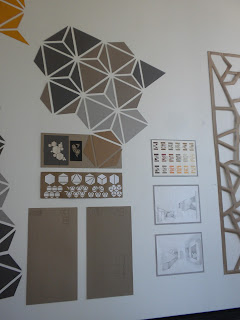
We placed emphasis on shape, color, and texture in our presentation, but as a whole I believe our strongest emphasis is on the hexagonal pattern that we plan to incorporate in a large scale. 

Unity:
Unity is achieved through repeating geometric forms throughout the space. We also hope to achieve unity through a warm color scheme. 

Proportion:
Our overhang structure is dramatically scaled to create hierarchy using proportion. Smaller elements such as braille complement larger pieces going into the space. 

Line:
We have used very harsh lines and sharp angles to create a modern, industrial aesthetic. Softer lines are incorporated in wall fixtures and the overall trellis structure. 

Color:
We decided on a warm color scheme mixed with neutrals. We have 3 different color options that combine reds, oranges, browns, yellows, grays, and beiges.

Shape:
Geometric shapes such as hexagons, triangles, and circles have been used so far. We will be incorporating softer shapes such as circles to complement our design

Texture:
Texture has probably been the most important element thus far in designing a facility for the blind. We first used braille inspired textures to use as wall or floor coverings and then expanded to geometric textures. In our models we used textured paper, cardboard, styrofoam, plaster, metal wire, chip board, bamboo skewers, etc. to create and explore texture. Texture in our final project will be to direct users to focal points and highlight important areas. 

Form:
Geometric forms, especially triangles and hexagons have been a focus in this project. We have tried to incorporate softer forms with the use of curves in the trellis structure and other wall elements. 

Space:
Negative space is an important element in creating texture and shadow. Within the negative space in the hexagonal pattern 

Thursday, October 6, 2011

Inspired by Fallingwater

When I stumbled upon this "luxury villa" in Thailand, it reminded me a lot of Fallingwater. 

Here's the link to the website:

it's pretty awesome.

Tuesday, October 4, 2011

Dale Chihuly

I just discovered the sculptural glass works of Dale Chihuly and had to share. These are simply amazing.

http://www.seriousluxury.com/dale-chihuly/

http://twilightfromthecold.blogspot.com/2009/03/glass-art-from-dale-chihuly.html

This piece is from the ceiling of the Bellagio in Las Vegas:
http://www.royallyflushed.com/general/bellagio-glass-artist-dale-chihulys-work-on-exhibit-in-phoenix/

http://arrynvogan.wordpress.com/2011/02/17/artist-of-inspiration-dale-chihuly/

Sunday, October 2, 2011

Interior Lighting Effects

This is a photo of artificial light affecting the space; an overhead light casts a shadow from the chair onto the floor.

The elevator door in Tower Village suites is a vertical reflective surface.

A recessed light that causes a shadow above the door is another example of artificial light affecting a space.

This photo shows daylight entering a space.

A reflective floor surface shows the reflection of a table and chairs.

A mirror is an obvious reflective vertical surface.


More natural light entering a space, onto a restaurant table.

Reflective floor surface in the Gatewood lobby.