Showing posts with label IAR 102. Show all posts

Thursday, April 28, 2011

A Writer's Retreat

For our final project, our assignment was to redesign Saint Mary's House on Walker Avenue into a Writer's Retreat for visiting scholars of UNCG's MFA Creative Writing Program. The building was to function as both a semester to year-long living space for a visiting writer as well as a place to hold public readings and meet with students. 

My space is cottage inspired, creating a cozy environment for a writer to write as well as keeping with the historic feel of the building. I achieved this through the use of beams to visually lower the high ceilings as well as softer chandelier and lamp lighting. The furniture also keeps with this more traditional style. As you enter the building, you step into a foyer space with a built-in bench seat so if there is a public reading happening, it will not be disturbed if people arrive late. This can also serve as a place of reflection or preparation for the writer before readings. To the right of the foyer I included the public bathroom that was away from the main public space.  Through the public reading space drawn below is a conference room to meet with students that is separated by sliding panels, so more space can be created for a public reading if need be. Behind the conference area is a semi-private living room and kitchen, and a bookshelf-lined hallway leading to a private office. Across from the office is a private bathroom, and adjacent to the office is the bedroom. One of my main goals in designing the space was to establish an intimacy gradient that would fit the needs of the writer and make living more comfortable. 

Perspective of the Public Reading Space

Perspective of the Office

Perspective of the Bedroom

Plan

Longitudinal and Transverse Sections

Model of Saint Mary's House that my group built




Tuesday, April 12, 2011

Dining Space: Final Compositions & Model

Our assignment was to design a dining space to host a biannual celebration for International Eradicating Hunger Day in 2015, coinciding with the summer and winter solstices. We were told to incorporate social media to include guests from other parts of the world. The requirement was to design a table, sideboard, and space that will facilitate celebration over food for 4-10 people with international connection via social media. 

I chose to design my space in a New York City apartment. Social media was incorporated through my dining table via a screen that would rise out of 2 glass panels in the base, allowing the dinner party to video chat and have dinner with people all around the world. I used translucent and reflective elements such as the ghost chairs and glass chandelier so when lighting is changed from warm to cool in the summer and winter solstices, it will be captured in these surfaces. I also included a balcony with a glass railing that another screen could be projected out of, allowing the dinner party to go outside and view a fireworks show as part of the celebration while having after-dinner drinks or dessert and still being able to communicate with the international guests. I tried to maximize space in the room by having built-in banquette seating and a built-in sideboard. 

Perspective, Elevation of table area, Social Interaction diagram, Axon, and plan

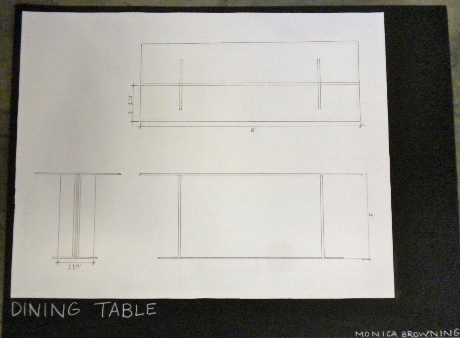
Dining Table Orthographics

Sideboard Orthographics, Dining Chair selection, and Materials

Model

Back view of the model, showing the proposed balcony

Tuesday, April 5, 2011

A Whole New Mind: Design Website Reviews

In A Whole New Mind, the author urges us as designers to read design magazines or blogs to "sharpen your eye and inspire your mind".  In my design process, finding precedents online and in design blogs inspires me and always gives me new ideas on ways I can create something that is cohesive, stylish and well designed. Here are a few I find interesting and inspiring:


Yanko Design
Yanko Design is a web magazine that features modern international design. It includes technology, interior design, industrial design, architecture, fashion etc., but looking through the website I see a strong emphasis on product design and technology, focusing on the latest and greatest gadgets. Most of the featured items of the week include everyday items that optimize function and convenience. When I see this site I am constantly thinking "ooh I wish I had one of those..."
This week, Yanko Design features a very interesting interview with Karim Rashid that is very much worth reading.
http://www.yankodesign.com/

Design Sponge
Design Sponge focuses much more on interior design with an emphasis on home living with sections such as "DIY", "Before & After" and "Recipes".  This blog really helps the everyday person create a stylish space in their own style. The blog creates groupings of furniture, textiles, fashion, and color palettes for the reader that all correspond with the same style, which really make it easy for a person who may not know that much about design or certain styles to pick a look that they like and know how to make it happen through color, furnishings and other entourage in a space.
http://www.designspongeonline.com/

Apartment Therapy
Apartment Therapy focuses on design for small spaces, something that young adults and students like me can relate to. With the motto "Saving the world, one room at a time", Apartment therapy helps urbanites and yuppies make their otherwise drab living spaces into well designed ones with a defined style. The website uses precedents from major cities (New York, Los Angeles, Chicago, etc.) to inspire readers with other well-designed small spaces. Tabs at the top of the main page such as "cooking" and "green" also appeal to the home living interests.
http://www.apartmenttherapy.com/

Thursday, March 17, 2011

A Pattern Language

Intimacy Gradient:
I plan on creating a design for the visiting scholar space that has an appropriate gradation of intimacy. Since literary readings and meetings will need to take place there, I need a formal space where the visiting writer can accommodate a small audience without the being intrusive in private areas.  I plan on a smooth transition from front porch (least intimate), to entrance hall, some sort of living room, kitchen and bathrooms, office, and bedroom (most intimate) in the back of the building in order to not encroach on the writer's privacy. This will also create a sound barrier to make back rooms quieter by being a greater distance from public, louder areas.

Indoor Sunlight:
Although I cannot change the orientation of the building itself, The most important rooms will already have south facing windows according to my plan for intimacy gradient. All of my public reception spaces will be at the south end of the building and therefore have south facing windows. This will provide a more cheerful environment for hosting events and adequate natural light for rooms where the most action will be happening.

Common Areas at the Heart:
I am planning on having a reception room just beyond the entrance area, the "heart" of the building. This is where scholars will meet and host events, and where guests will spend the most time. The reception room will be a pathway to all other rooms, so it will be convenient to navigate to from any space in the building. This room will feature plenty of seating and tables, that will be conducive to meetings and discussion. I want this space to flow seamlessly into the kitchen, so as the kitchen area seems to be part of the hearth of the space or can be closed off it need be.

Short Passages:
There will be a short passage from the common reception room into the private section of the house (office, bedroom, and bathroom). This passage will include shelving for many books, which will be a necessity to any writer. By attaching to both office and common room, the scholar will be able to retrieve books for both personal study and group reference and discussion. By doubling a passageway as a pseudo-library, space will be saved and function will be increased. One side of the passageway will be lined with windows to give light and to not feel too narrow or closed in.

Thursday, February 24, 2011

Personal Space: The Behavioral Basis of Design

In Robert Sommer’s Personal Space: The Behavioral Basis of Design, he explains the psychology of group interactions that relates to seating arrangements. This relates back to the dining space in the way that I am designing: in the shape of the table, the distance between chairs, the type of interaction that will be taking place, etc. Sommer defines group as “a face to face aggregation of individuals who have some shared purpose of being together” and social influence as “the way the presence of one person affect[s] another”.  Both of these factors play into the experience that my dining space will be designed to facilitate.  The group will be dining face to face, both in person and on video chat, for Eradicating World Hunger Day.  The sense of a group sharing one common goal is what makes the dining experience especially intimate. Although intimacy as a dining experience is a goal, Sommer shows that enough personal space allotted for each person at a table is crucial in order for people to not feel uncomfortable.  This is not the same for humanity as a whole, but varies across cultures. The social media aspect of the dining table via a screen will ease this culture gap. Sommer also shows that people respond differently to square or rectangular tables than round tables. It is shown that in rectangular tables like the one I have chosen, conversing was best done across from another person. This will benefit the purposes of my dining experience because the video chat screen will be directly across from the person who is having the conversation. 

Tuesday, February 22, 2011

Dining Space: Plan, Axon, and Sketch Model

Plan View at 1/4"= 1'0" Scale

Axon at 1/4"=1'0" Scale

Sketch model of my table, with the mirror paper representing the screen that will rise out of the table base

beginning of the room model

Dining Space: Parti


For my parti, I used my precedents to explain my intentions for how I am going to apply those ideas in my space. I used examples of the warm and cool lights in the dining seating with a picture of ghost chairs that have some tint of color. I wanted to apply lighting to these transparent chairs to create a color effect that corresponds with the seasons. Below I showed how I intended to use the lighted crystal curtain inspiration to choose a chandelier that looks like water droplets. I also wanted to use colored lighting in the chandelier to mimic what will be happening on the chairs. On the lower left corner I included a picture of a modern glass top table and drew a screen on top to show how I intend to bring social media into the space. On the top corner, I found inspiration for a minimal modern sideboard, but for my space I wanted to apply this idea to something built-in.

Precedent Studies

In preparation for designing our dining spaces, we were told to pick three precedents: a dining space, a public ritual space, and a social space. 

Dining Space: I picked this particular restaurant because I loved the effect the light created when illuminating the divisions between the seating. The color of light can be changed, which was something I wanted to incorporate into my project to commemorate the summer and winter solstices. 
Morimoto Restaurant, Designer: Karim Rashid (www.karimrashid.com)

Public Ritual Space: I picked the design of the Kodak Theater during the 82nd Academy Awards because I loved the effect created by light shining onto the crystal curtain. It reminded me of a waterfall, and I thought I could create a similar effect using a chandelier, using warm colors for the summer solstice and cool colors for the winter solstice. 
Kodak Theatre (82nd Annual Academy Awards) Designer: David Rockwell (www.rockwellgroup.com)

Social Space: As I was browsing several high-end nightclubs, I came across the Industry Nightclub. Again, the lighting effect is what inspired me to bring into my space...it definitely creates a mood that evokes intimate conversations, which I wanted to achieve in my own space. I also liked the idea of bench seating as a way to make my dining experience more intimate. 
Industry Nightclub, West Hollywood (www.evitaparties.com)


Tuesday, February 15, 2011

Dining Narrative: International Eradicating Hunger Day

In 2015 the first of the United Nations mandated eradicating hunger days has arrived, and one group of friends and family is gathering in one of the satellite dining spaces around the country that is equipped with the necessary social media devices to connect with people of all different countries in order to share a meal together.  This dinner party of ten will be dining in a pent house apartment overlooking New York City.  As the group enters the dining space, they are seated on a tufted banquette along with Louis XV ghost chairs that are illuminated in warm light to commemorate the summer solstice. The seating is situated around a ten-foot long, 3½-foot wide modern rectangular glass table. Above the table a dramatic crystal chandelier hangs that has the appearance of water droplets falling over the table; this is also illuminated in warm LED lighting. The place settings show each guest at the table what nationality the person whom they will be dining with via web chat; the India setting has no silverware, the China setting has chopsticks, etc. and each setting has the flag of their designated guest country on the plate. The guests are seated comfortably with four on the banquette, two at the heads of the table, and four in chairs along the side. As the party sits, a screen rises up from the center of the table and their international cyber guests greet them. After the introduction, the server brings the food in several courses, with dishes from every country represented at the table. A built in sideboard allows a place for serving platters. Above the sideboard is a mirror with a map of the earth cut into it, which reflects the chandelier on the table. Now that each of the guests of the pent house have conversed with a member of a different country, they exit onto the balcony for coffee and conversation about their experiences at an international dinner, some perhaps still sharing views of New York with their dinner partners via laptops. A firework show brings the end to the cultural celebration.

Friday, February 11, 2011

Design and Culture

Design and culture have a two-way relationship; design is always influenced by its surrounding culture and culture is in some ways influenced by design. We saw an example of this after viewing the film “Babette’s Feast” in class. In the 17th century Puritan community of Jutland the architecture and design elements reflected the peoples’ culture. Since Jutland is an isolated peninsula on the Scandinavian coast, the houses were closely clustered together to provide closeness for this tight-knit community. The architecture as well as interior elements were very simple, reflecting the pious, rigid ideals of the people: their focus was on God and worship and not on material things with ornamental flourishes. The main interior room of the religious leader’s house was very plain except for one table to accommodate neighbors who worshipped there together. The only artwork was dedicated to their minister who had passed away. There is a contrast however, when the French maid Babette proposes to cook a feast in honor of the minister. The table in the scene of the dinner party was very decorated, with candelabras, linens, and multiple place settings with fine china and crystal stemware. This reflects the French culture of opulence, and it is seen that the plain people of Jutland are uncomfortable with this…the decorations are showed to cause somewhat of a culture shock. A main way that Babette brought her culture to the people of Jutland was through design, and the space along with the food were the main vessels through which the people experienced this.


Tuesday, February 8, 2011

Social Media Product: The Portal

Imagine coming home, opening the door, and instantly being greeted by all of your friends. The social networking entry door automatically logs a user in when they come home, allowing the homeowner to check what's new on Facebook and Twitter without unpacking their laptop. This will cause a change in the way people transition from being out and about to settling into home life-- they will set down their keys, hang up their coat, immediately check Facebook notifications and tweet, all conveniently within a minute of standing in their entryway. Before leaving home, the user can update statuses of what they are about to go do. This will all happen by means of a touch screen that will be projected onto the entry door when the user returns home and will also automatically log the user off when they leave. If the user's hands are full while entering or exiting, they will not miss out because of the voice post feature of the networking door. While the networking door isn't being used, it will have the appearance of either an elegant traditional raised-panel door or a sleek modern door with horizontal rectangular sections. The internet features can also be accessed at any time by a small button under the door handle.

Parti


a modern version

a traditional version


model version, renamed "The Portal"

Thursday, February 3, 2011

Manifesto

Design is not something you can just “whip up”, by thinking of a solution after being given a task and saying you are finished.  Richard MacCormac put it very well, “I don’t think you can design anything just by absorbing information and then hoping to synthesize it into a solution. What you need to know about the problem only becomes apparent as you’re trying to solve it.”

Design is all about process. Process is all about failure. This is one thing I know for sure since coming to Greensboro this fall to embark on this scary, overwhelming, yet exhilarating and rewarding journey that is becoming a designer.  Starting on the first design tasks was very daunting; you are given instruction and have to think creatively, coming up with a design solution by a certain deadline, which gave me an enormous feeling of pressure during the early projects. Then after some experience working on these crazy projects, I realized that each time I came up with a “solution” something was wrong with it. I had failed. But these failures led to great discoveries and “aha” moments, forcing me to design the same project over and over again until they showed significant improvement.  This gave me more confidence in myself, and a drive to always figure out what it is I can do to make my work better. This could be looking at similar works of previous designers, talking to professors, peers, or just looking at my work again in a few moments time, trying to discern what should be changed about my work to make it come closer to the goal of the project. After failures have occurred, thought, precedence and community brings a designer into final stages of refinement and a great result.

Monday, January 31, 2011

Color Week

Color week (also known as color bootcamp) was an exciting week of learning about color alignment and creating compositions using 220 hues of Color-Aid paper. 

The colorful hallway: classmates' work on display

2 colors with a middle mix in between 

2 "overlapping" colors and their middle mix

4 colors with a shade in the center and their middle mixes

After the first two compositions, I got used to cutting the color-aid paper and learned how to dry mount; my craft improved a lot. 

3 triangles with their three-way mix

Color Palette

An abstract, artistic composition of spring, summer, fall and winter using the colors from my palette.


my body of work from the week

Sunday, January 30, 2011

Nigeria and Social Media

When you think of social media, you usually do not think of Nigeria.  However, Nigeria is perhaps equally affected by social media as many of the more developed countries.  In fact, there are over 1 million active Nigerian Facebook users, including the Nigerian president.  A site called newint.org  states the Nigerian social media status like this: To put social media into Nigeria’s context, it is important to note that out of a population of around 150 million, between 70 and 80 per cent of people live on $1 a day. Around 43 million people in Nigeria – almost a third – are estimated to have access to the internet. However, this figure doesn’t break down into those who have internet access at home or at work and those who occasionally use it in public cafés. Nor does it correlate with the numbers living on $1 a day or the literacy rate of 50 per cent.”  Contrary to this poverty-stricken demographic, there has been a “blackberry buzz”, where Nigerians popularized gaining access to social networking sites on their cell phones, much like most of America. Several online articles showed the areas social media affects the most.  Most Nigerian students have Facebook pages, and a concern continues to be its detrimental effect on education. A site called allafrica.com posted an article stating that the social networking craze “if left unchecked could further affect an already collapsed education system.” Another site notes the significance of social media in Nigerian elections, political parties using Facebook and Twitter to promote certain candidates. This without a doubt shows social media’s impact on individual countries and the world. 

Friday, January 28, 2011

Light Box

Our assignment for this project was to make a five-sided box (12x12x18") with one side open for viewing. By using a remote light source that shines through a series of openings in the box, we were to create a pattern of light [illuminated space] within the box that divided it into four parts. We were then told to articulate and modulate the planes of light using bristol board or bamboo skewers to reinforce or compliment the illuminated spaces. 

I approached this project by experimenting with cutting alternating notches on the top and sides of my box. I wanted to create 4 fields of light that would be projected on both the walls and floor of the space, to think three-dimensionally. Into the project I realized that smaller notches worked better and created sharper and more defined areas of light, so I taped over the larger notches I originally cut. This also made the edges of the foam core more defined. I used bamboo skewers to suggest the idea of columns in the space, which aided in the simple, minimalistic feel I was going for. I wanted the bamboo "columns" to look grand in height so I made my scale figure accordingly.


Final Project with scale figure


first introducing skewers to define the space


Box with original slits and non-point source lighting

The original slits


The starting point