Showing posts with label IAR 211. Show all posts

Sunday, November 13, 2011

Signage Precedents

http://www.apcosigns.com/infolock.asp

This example is the "info lock" system from APCO Signs. The idea is that there are several interchangeable tabs behind a hospital sign that allow doctors and nurses to display information regarding the patient. There is a security button under the sign which allows only authorized personnel to change the information. Even the background of the sign and the finishes can be changed. I thought that this sign was brilliant because it an easy to understand system and it is more efficient and better looking than just posting these pieces of information on the door via paper or whiteboard. 

http://www.window.state.tx.us/specialrpt/tif/southtexas/healthcare.html

This example of architectural signage is from the Edinburgh Children's Hospital. The main sign displaying the name of the hospital is spelled out using building blocks and this theme is continued with block-like sections covering the entire facade, with whimsical animal images on each one. I liked this use of signage because it makes children feel less scared to go to a hospital when the exterior is friendly and playful. 

http://customsignsdenver.com/products-services/glass-signage-donor-walls/

I find glass signs inspiring because light can pass through, reflections draw your eye to them, and they usually are very clean-lined and modern looking. A glass signage system would give a business an overall sophisticated feel.

Monday, October 24, 2011

Instructional Compositions


IKEA generally has very successful instructions that come with their home assembly products. In the composition above, IKEA uses simple, easy to understand illustrations along with humor to show how to  assemble their products in a user-friendly manner. 

I thought that this origami instruction composition was successful because it gives a clear order of how to fold the origami by using numbering and a path graphic leading up to the final product. The color also ties the composition together. 

Thursday, October 13, 2011

Photoshop Compositions

For this composition, I first placed all of my images as different layers and scaled all of my images to the desired size. I then experimented with moving the images around until I decided on a layout. I used the text tool to title my composition and the line tool to create the "violin strings" as a border that I liked from my original composition. 

In this composition, I used the same process to scale and place my images, but decided on a different layout. I used the eyedropper tool to highlight the orange accent color in my perspective for the text and the lines. I decided on a more appropriate font for my violin concept that was more visually interesting. 

In my third composition, I scaled and placed my images in a way that gives more hierarchy to my perspective, by having my sections and plan to the right and my perspective framed by the border. I used the eyedropper tool to highlight my violin brown to use in my title and border. I kept the same script font from my second composition because I thought it was successful in conveying my concept.

Sunday, October 2, 2011

Interior Lighting Effects

This is a photo of artificial light affecting the space; an overhead light casts a shadow from the chair onto the floor.

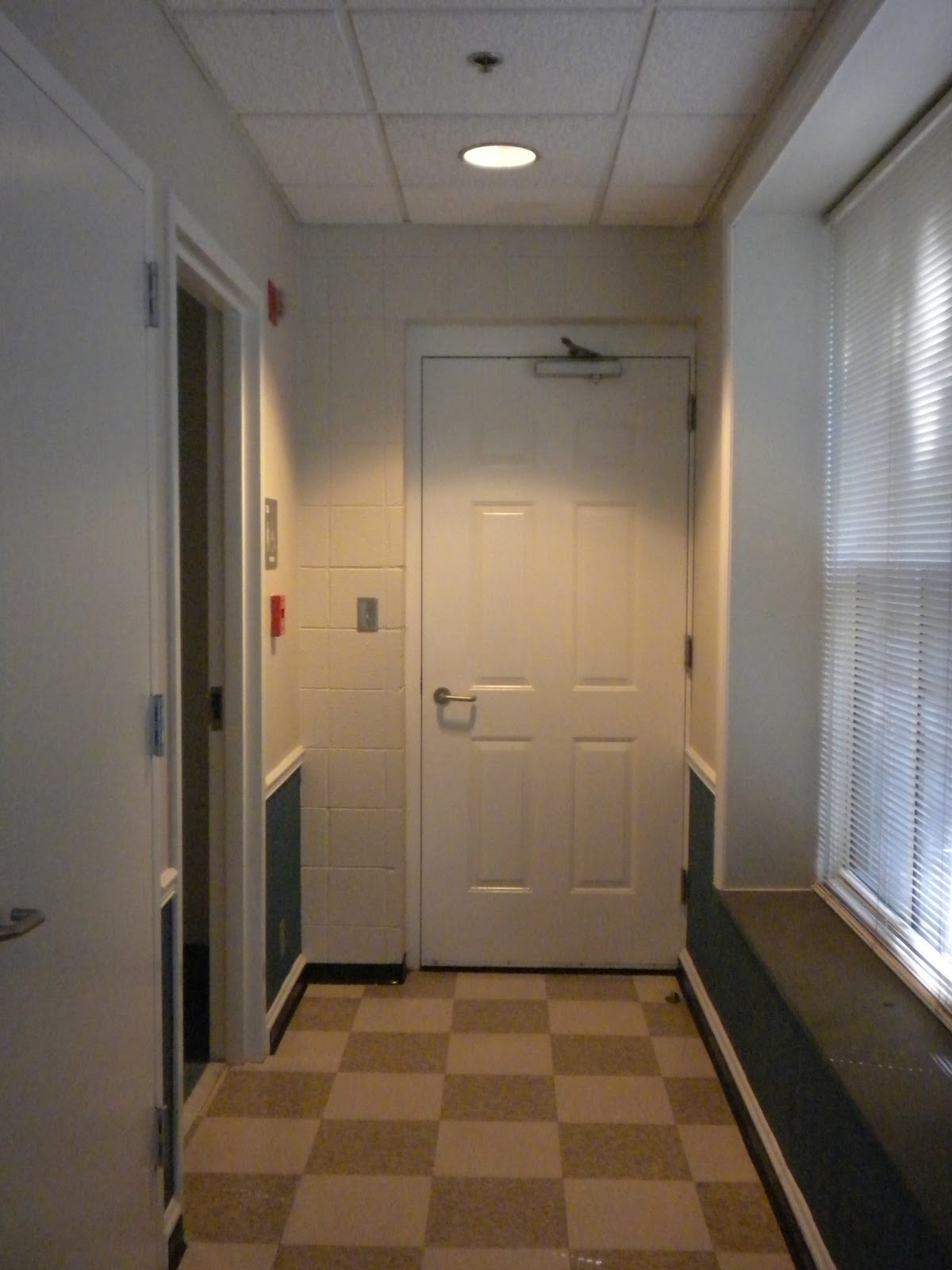
The elevator door in Tower Village suites is a vertical reflective surface.

A recessed light that causes a shadow above the door is another example of artificial light affecting a space.

This photo shows daylight entering a space.

A reflective floor surface shows the reflection of a table and chairs.

A mirror is an obvious reflective vertical surface.


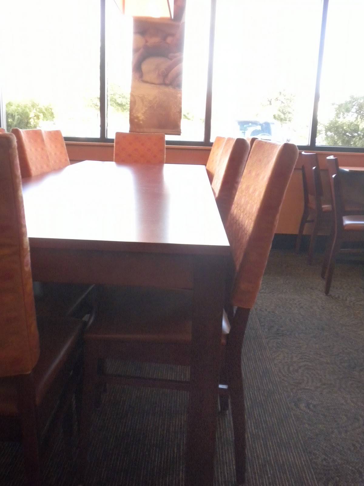
More natural light entering a space, onto a restaurant table.

Reflective floor surface in the Gatewood lobby.

Reception Space: Final Composition


Saturday, October 1, 2011

Successful Compositions


This composition was from landscape architect Janet Lee Coleman's website. It has clear hierarchy, the large colored plan on the right is commanding the most attention. This drawing also has the most value, which adds to the amount of attention given to it. She pulled colors from her rendering into the graphic on the left and her border, which is cohesive with the rest of the composition. I chose this composition because  I thought the border and graphics were successful in drawing attention to the drawings. 


Hierarchy is present with the size of the left image drawing more attention than the right images. High value is used in all of the computer renderings in an equal way which makes all of them read clearly.  The designer pulled color directly from the renderings into the background and border which makes for a cohesive look. I chose this composition because of the use of color in a successful way as well as the incorporation of information into the border.


Tuesday, September 27, 2011

One Point Perspective Sketch

In visual communication, we were to sketch a one point perspective of any space and I chose to sketch my room at school:


Thursday, September 22, 2011

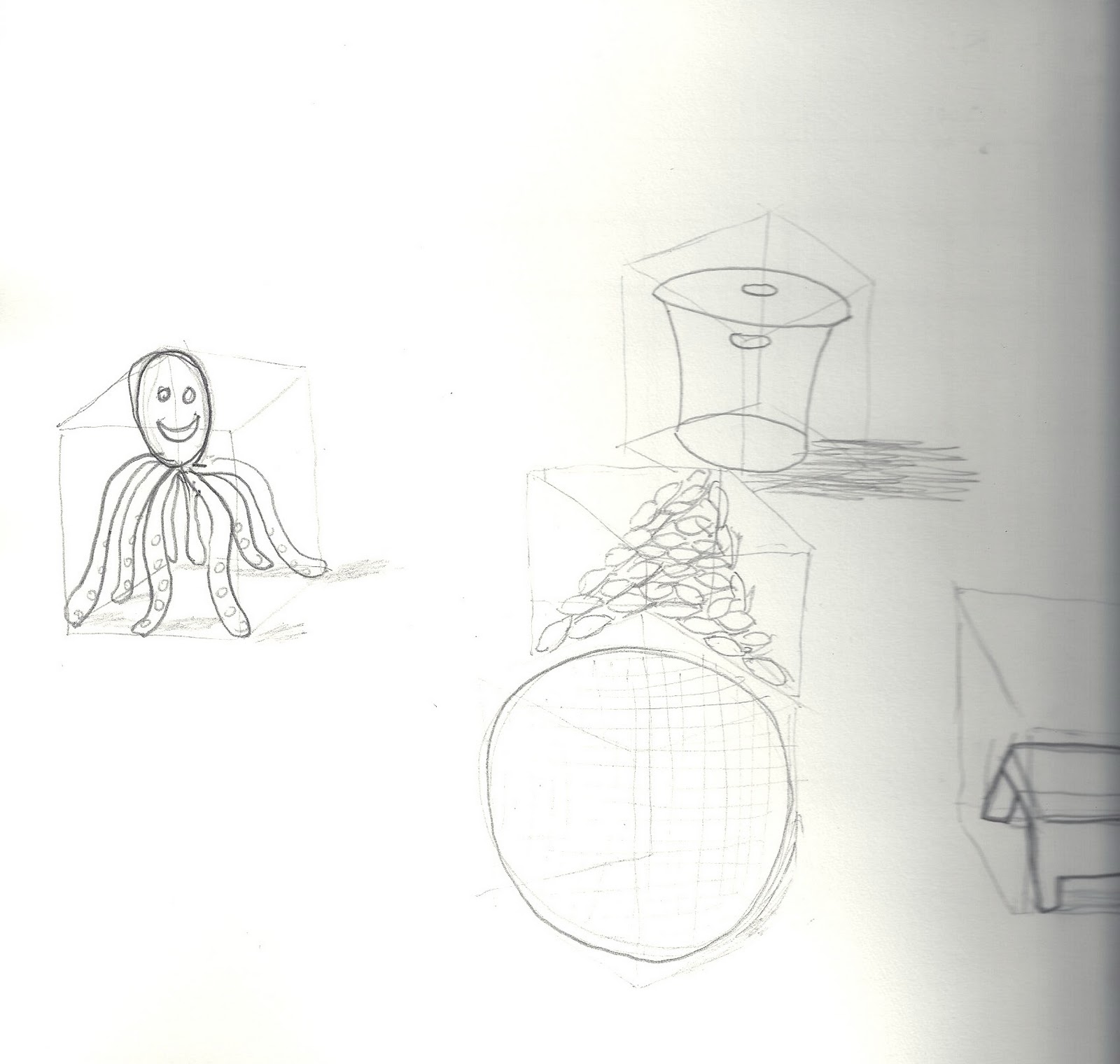
Sketching in boxes

Today in class, we used wireframe boxes to act as guidelines for where we sketched certain objects. We drew one irregular-shaped object (I drew a toy octopus), a trash can, a pile of lemons, a ball, and a footstool. 

Tuesday, September 20, 2011

Reception Space Inspiration

http://www.turbosquid.com/3d-models/3d-model-reception-space/490120

I liked the use of lines in this reception space, which relates to my violin concept. I also liked the use of smooth material and the play of light & dark colors in the space.

Thursday, September 15, 2011

Reception Space: Sketchup and Color Studies

Sketch of the floor plan


Sketch of the one-point perspective

Sketch of the two-point perspective


I decided that the warm color combination was the most successful color study because it most conveys the concept of a violin. 

Abstract Geometric Perpective: Violin

For this assignment, everyone in our class randomly picked a concept from a box, written down by someone in our class. My concept was violin. We were to create an abstract geometric perspective using this concept and the basic principles and elements of design. 


For my final two-point perspective, I decided on drawing long rectilinear forms inspired by the strings of a violin, and curved shapes inspired by the curves on the body of a violin. I explored material especially through the curved forms in trying to create the look of zebra wood used in some violins. 


Wednesday, September 7, 2011

SEC Poster Contest

In Visual Communication, we participated in a poster design competition for the 2012 Southern Entrepreneurship in the Arts Conference. The theme was "Creating Entrepreneurial Magic in the Arts" and we were to use a rainbow motif to show how the aspects of creating a successful art business converges into a "pot of gold"which is success.  

Monday, September 5, 2011

New Blog Header!

In Visual Communication, our first assignment was to design a name tag for one of our classmates, who was to act as our client for the design. Kate Ewen designed my blog header according to the specifications I gave her:

-Cool colors
-Incorporate a pattern
-Playful
-Elegant
-Simple and contemporary

The main reason I am using this name tag as my blog header is because I think Kate did a great job in capturing my style as a designer-- the design is playful and elegant, due to the bright damask-inspired pattern that seems to dance across the paper. I also like the simplicity of the letters in my name as well as the cool color scheme. It exceeded my expectations.

Tuesday, August 30, 2011

Abstract Geometric Perspective: Concept

Concept: Violin

Design Principles 
-Proportion: Bottom significantly larger than top
-Balance: Symmetrical instrument (other than chin rest)
-Unity: Curves and material tie instrument together
-Emphasis: Curved body of the instrument
-Rhythm: Alternating strings, repeating curves

Design Elements
-Space: Hollow inside, holes are negative space
-Line: Vertical line of strings, curved line of wood
-Texture: Smooth wood grain, strings, bow hair
-Value/Contrast: Dark color, contrast of strings against neck of instrument
-Color: Reddish brown, black
-Shape: Oval shape with concave indentions
-Form: Curved body, straight neck

Thursday, August 25, 2011

Name Tag Design [Kate Ewen]

For Kate's name tag, she asked for a clean and simple lines, muted colors, and a uniform look in the letters of her name. In my first draft, I decided to create a modern design that I believed represented Kate as a designer. I experimented with a gradient look using a muted blue prismacolor marker, and used dark purple for the lettering and lines, since that was one of the colors that Kate liked.


In my revision, I decided that gray letters would complement the soft blue tone more so than white. The gray marker on top of the blue marker created a unique white-out effect that made the overall design look more interesting.


The principles and elements of design are also present in the name tag.  It has a sense of proportion-- all of the letters are the same size and take up almost half of the overall name tag, which is substantial and creates a unified look. All of the letters are spaced evenly apart, spanning across the length of the tag which contributes to the balance of the design. The lightness at the top of the name tag also balances with the light color of the letters at the bottom. The fact that all of the letters are the same size and are spaced evenly also contributes to the principle of rhythm. Each letter creates an equal "beat" across the name tag.  A happy accident that took place when I used the gray marker on top of the blue was the play of positive and negative space, the letters being negative and the solid lines of the blue floating on top of the name. This design takes advantage of a straight horizontal line that is continuous across the name tag.  I considered the constrictions of a header on blogger in the shape of the name tag. I wanted the form to be simple and easy to scan and display. Since Kate wanted muted colors, I decided on this cool blue tone that would play well with a soft grey. Texture is evident in this design through the soft, watery blending of the marker.  Finally, I played with value and contrast in the gradient pattern, moving from darker and heavier at the bottom to lighter at the top.