Showing posts with label Light & Sound. Show all posts

Sunday, November 24, 2013

Sound Paper


Growing up in a church that was similar in architecture and volume to a small cathedral, I could relate to much of what Rasmussen was discussing in “Hearing Architecture”.  Although it was not quite so large and domed that the minister had to sing or talk rhythmically to address the congregation, the large vaulted ceiling of the church caused much reverberation so that when the choir sang there was a beautiful, ethereal quality to their voices. This made the experience of attending church seem more heavenly and sacred, and the large volume of the sanctuary which caused such an acoustical quality created a grand kinesthetic experience of all its own. This was definitely an example of how one can “Hear Architecture”. The acoustic quality of the church service was directly affected by the high vaulted ceilings -- a purposeful decision made by the architect to create an grandiose and heavenly sound experience that reflected the sacred meanings of the hymns the choir was singing.  After attending other churches, I missed the beautiful sounds that reverberated in the sanctuary.  Unfortunately this tonal quality cannot be replicated unless the correct architecture is in place to cause it, which is rare in the more modern churches of today.
            Another experience that I am familiar with along with most other people is the change in sound quality when in a bathroom covered in sound reflecting tile. Singing in the shower can make the tone anyone’s voice sound better, especially when singing long vowel sounds, due to reverberation.  As a chorus member throughout high school, I would always rehearse songs in the shower because of the rich tone it would give my voice due to the reflective tile.  Many other people sing in the shower for this reason. Bathrooms generally don’t have absorptive materials in them so nothing hampers the sound’s ability to bounce off of the tile surfaces and cause a slight echo.  Bathrooms with higher ceilings enhance this effect, but can almost hinder the ability to understand someone if you are talking to them because the words you say take so long to bounce back to you and run together if you are talking at a normal speed.  People generally do not have long conversations in the bathroom, but I have been on the phone with people who are standing in a bathroom and it is very hard to hear due to the high level of reverberation. This is why in environments such as living rooms, restaurants, and offices where people will be holding long conversations, good acoustic quality and absorptive materials are crucial to one’s ability to understand speech.  Dining in restaurants with little to no absorptive materials, such as East Coast Wings on Tate Street, can be very frustrating because you cannot hear the person you are talking to over the din of other people’s conversations bouncing off of the walls. 
            Sound quality is very important to the experience of a space. It can either cause the experience to be pleasant, such as a reverberant cathedral, or unpleasant, such as a noisy restaurant. It is up to the designer to ensure that the acoustics in a space matches the needs of the user. 

Lighting Tradeshow


Wednesday, November 13, 2013

Sound Sketch Series

I examined the 3rd floor of the studio for my sound sketch. The materials in almost all of the spaces were simply painted gypsum walls, concrete floors, and hard steel and plastic furniture. This gave the sound more reverberation time, and echoed in spaces that were larger and more empty. Two exceptions to this were the library and computer lab which have carpeted floors and upholstered furniture. This greatly reduced sound in decibels as well as reverberation time. You can see a significant difference in all of the diagrams between the library/computer lab and the rest of the studio spaces. There is also a notable difference between times of the day, due to studio classes. You can see that at 11 am on a Monday, the studio spaces are fairly loud due to morning studio classes occupying the space. The decibel level increases around 4 pm when the afternoon studios are in the space as well, and students are hanging around to get work down in the afternoon. Noise levels greatly diminish at night when classes have left and only a few students are in the building to work. 

Sound greatly impacts interior design and our experiences in a space. The desired acoustical environment determines what materials shall be put in a space, such as carpeting and upholstered furniture in the library, as well as the shape and volume of the space itself.  Lowered ceilings in the library, conference room, and computer lab make sense because these spaces are desired to be quieter than studio spaces which are more collaborative. Sound can impact design decisions such as the inclusion and placement of acoustical panels, wall thickness, and insulation. Sound also influences your perception of privacy in a space- spaces tend to feel more private if they are quieter. This is why it is good to have different acoustical spaces in the studio to accommodate collaborative vs. independent work. 

Sound Levels- 11 am Monday

Sound Levels- 4 pm Monday

Sound Levels- 9:30 pm Wednesday


Wednesday, October 2, 2013

Sketch Series 4


Illuminance level was taken at a 36" high desk.  Reflectance was measured using an aluminum sheet, and transmittance was measured by the light source passing through paper. 

Sketch Series 3

                                   Fabric 1          Fabric 2          Fabric 3         Fabric 4

I was very surprised at the extent of the color variation of the fabrics under different light sources. The colors of the material varied significantly from light source to light source. You can see how dramatic the changes in color are yourself by looking at each of the columns above and realizing that each column is the same fabric and color in reality. One fabric can range from green to gray to yellow or orange depending on the light source. Overall the colors seemed the most "true" under 5 pm natural daylight- which is the optimal color rendering quality. Colors seemed very red under halogen lights, somewhat orange under fluorescent light, greenish under metal halide lamps, and bluish under LEDs. This shows what hue of light each of the lamps emit. The colors even varied over different times of day in natural daylight, from grayer in the morning to brighter and warmer in the late afternoon. 

Tuesday, October 1, 2013

Sketch Series 2


My first sketch was taken from Kiosco Mexican Grill on Spring Garden Street. Kiosco used incandescent lighting via recessed lamps to achieve strong ambient lighting as well as incandescent pendant lighting for task lighting at the bar. Overall, the lighting was fairly strong and glary, and the amount of lighting was a bit overwhelming for the space. I believe the restaurant could achieve a much more pleasant and intimate atmosphere by scaling back the number of lights or dimming the lights to make them less harsh. Subtle lighting came from two TVs, which did not provide significant lighting or obstruct the existing lighting scheme. Lighting was fairly even across this portion of the restaurant, and strong shadows were cast throughout from furniture and some shelving. Patterns of light could be more effective by again scaling back the number of lamps and concentrating more on lighting specific areas such as individual tables. This atmosphere serves waiters and staff well because the bar and circulation paths are lit very brightly, but the experience for diners could be improved with softer, more intimate lighting in the dining areas. 


My next sketch was from the Barnes & Noble bookstore at UNCG. Most of the lighting in this particular area came from bright natural light from windows to the outside. Bright afternoon light came flooding into the space and blanketed the books and shelving. There were areas that had a certain amount of glare due to more reflective materials. Overhead fluorescent lighting constituted the secondary source of light and main artificial light in the space. This lighting was staggered and evenly distributed throughout the store. This made a big difference towards the back of the store where natural light was not as abundant, and did a good job of illuminating the merchandise without causing glare. More subtle illumination came from recessed halogen lights in small built-in shelving areas around the perimeter of the store These were effective in highlighting posters and books that were being promoted by Barnes & Noble. The lighting in the space, especially the natural light, caused dramatic light and shadow patterns in the edge of the store and created a bright and interesting space to browse in. Glare could be minimized in a few areas by using less reflective materials. Overall, the space is effective for reading and shopping, and provides a connection to the outside that doubles as a way to entice potential shoppers to come into the store. 


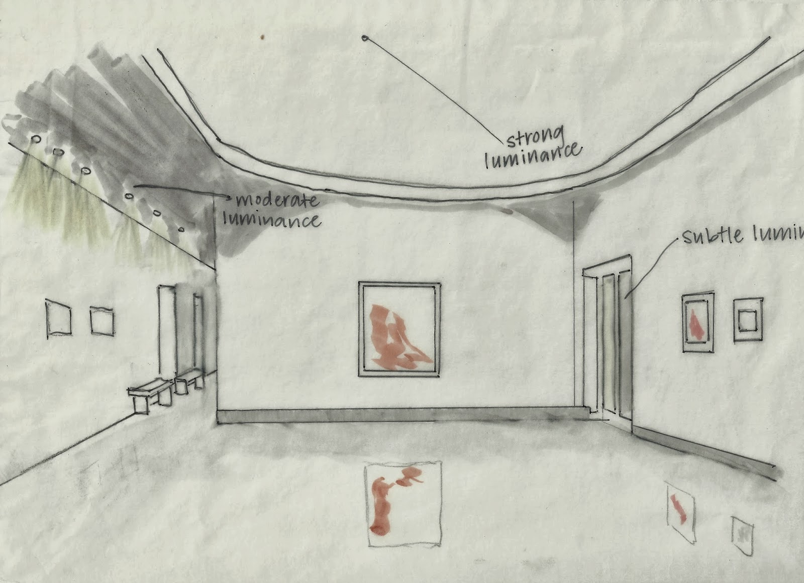
My last sketch was in the Weatherspoon Art Museum at UNCG. This space is very dramatically illuminated by a large clerestory many feet above the main open gallery area. Natural light floods into the space and illuminates the artwork and creates interesting shadows under the curved portion of the ceiling. Secondary lighting comes from recessed halogen lights in a corridor that leads to other galleries. This lighting is effective because it does not distract from the dramatic natural lighting effect, yet provides adequate lighting to travel along the corridor. More patterns of light and shadow could be introduced in the corridor to mirror the large clerestory in the main space. More subtle light comes in through the doors that lead to the outdoor courtyard, and inform the visitor that there is more to the museum outside. A highly polished concrete floor reflects the artwork displayed but does not cause glare due to natural light being used to light the space from a distance. This is a nice alternative to artificial gallery lights which may distort the colors in the paintings, and gives the visitor substantial yet unobstructive light by which to view the artwork. 

Monday, September 30, 2013

Sketch Series 1

For this assignment, I worked with Alex Pokas to find spaces on campus that felt spacious, relaxed, had perceptual clarity, and one particular space that felt unpleasant. We chose to sketch the Meditation room, room 401 in the Gatewood Studio, the lobby of the Weatherspoon Art Museum, and a floor of the library stacks. 

Meditation room sketch by Monica Browning

Floor Plan Sketch 


The Meditation Room was an example of what we felt was relaxed. This space has both overhead and peripheral lighting, somewhat non-uniform, in between bright and dim, and uses warm lighting. I believe that the diffused natural light contributes to making the space feel relaxed and peaceful. The center of the room had and overall warm feel due to warm recessed lights overhead as well as warm track lighting that highlighted the textured walls. The three different types of lighting in the space were in three different areas to create different zones. While the area by the window is very bright due to lots of natural light, the center of the room is more dim and feels very calm. The back of the meditation room is concealed by panels that block most of the light and make it very dark. This accommodates the prayer and meditation preferences of different people. Aside from designating different areas in the space, the different types of lighting add interest to the room, as well as highlight features such as art on the wall. 

401 Critique room sketch by Monica Browning

Floor Plan Sketch


The critique room is a space that we believed had perceptual clarity. The main light source in this room comes from a diffused skylight in the roof above, and spills through the opening in the ceiling of the room. A retractable shade is shading half of the space in this sketch, but can be opened fully to make the space very bright. While most lighting comes from above, there are track lights that span the walls that light student work during some presentations. In this particular sketch, the track lighting was turned off and the space was still very bright and clear. The particular ceiling filters in cooler hues of light, which aid in the clarity of the space. The uniformity of lighting can be changed with the moving of the shade, to create a fully washed space or a half-dimmed space. This can help when viewing digital presentations in the front half of the room. 

Weatherspoon Art Museum sketch by Alex Pokas

Section Elevation

The Weatherspoon Art Museum lobby is an example of a space that feels very large and spacious. Most of the light in this space comes in through a large clerestory above that channels the light downward in a large oval light well. Recessed lights line the corridor to the left of the lobby that leads to galleries and provides some light in the space. Some natural light also comes in through doors that lead to a vestibule and an outdoor courtyard. These secondary lighting elements are somewhat masked, however, by the large open space above letting in copious natural light. The overall hue is somewhat in between warm and cool and is very bright. The lighting is mostly uniform and almost exclusively overhead. The lack of significant furniture in the space also adds to the feeling of spaciousness.
Library sketch by Alex Pokas

Section Elevation

The library interior was an example of a space that feels unpleasant. Aside from the natural lighting coming through windows as seen in this sketch, the majority of lighting in the library comes from overhead fluorescent lighting. This leads to a very bland and unpleasant atmosphere. The lighting in the library is fairly uniform, with the fluorescent lights spaced on a grid overhead. The interior is fairly bright to be suitable for reading, and uses cooler light. Overall the space is very boring and uninteresting, with limited natural light. The few windows provide brief visual relief with a view to the outside, but most lighting in the space is generic and not very aesthetically pleasing. 


Friday, September 27, 2013

Light Box


Exterior Shot

Interior view of panels

Angled Interior View

 Lower Interior View showing diffused lighting in corners


Wednesday, August 28, 2013

Impact of Light on Health


            According to the two articles, there is clear evidence of a link between the amount and quality of lighting to our health and wellbeing. Too much light, too little light, or exposure to light during the wrong times of day can all be factors in serious health disorders.  One such disorder, Seasonal Affective Disorder (SAD) occurs when people are not exposed to adequate amounts of daylight for a long period of time. As designers, it is up to us to optimize daylight conditions in interior spaces when appropriate to prevent these kinds of adverse responses in our environment. Lack of proper daylight can cause even more serious health problems such as diabetes and reproductive complications, so it is paramount to ensure that people who are indoors for long periods of time, such as hospital patients, get quality daylight.
            Another health concern that many people have experienced is a disruption in their circadian rhythm as a result to too much, or the wrong quality of light at night. Because light delays the release of melatonin, too much light at night can disrupt sleep, even long after the light exposure has occurred.  This is very problematic with nurses who need to be awake and alert during night shifts but must sleep afterwards. Designers need to take these concerns into account when designing hospitals, so staff can effectively transition from working to sleeping without acquiring light-related illness.  Evidence-based design is the only way to effectively ensure that the lighting in interior spaces is healthy for those who inhabit them.

Thursday, August 22, 2013

Light Revealing Experience


           Thinking about light and place, especially the sun, brings about many memories of growing up in the south. Long summer days in North Carolina are characterized by hazy sunlight reflecting off of car roofs and swimming pools.  The light quality in the summer is almost blindingly bright and is associated with scorching hot days.  Winters however have much more subdued natural light with grayer skies. This is contrasted with the occasional snowfall when the sun reflects off of the snow and ice. This makes the outdoors seem even brighter and whiter.  When I think of my personal relationship with light and place in my childhood home, I think of my large east-facing bedroom windows and the natural light that flooded my room during the day.  Plantation shutters made patterns on my floor that shifted and grew narrower as the day progressed. This made my room feel a lot roomier and cheerful, and improved my mood on sunny days.
            When thinking about my experiences in nature, light plays a major role. Walking along the Eno River in my hometown of Durham, NC, light filtering through the leaves and reflecting off of the water makes the experience more enjoyable and intriguing. While walking along the trails, the lighting transforms from being very shaded to intensely bright within a matter of steps. The varying light transitioning with the trail makes the outing seem more like an adventure.  Another favorite nature spot of mine is Sunset Beach in North Carolina, where light dazzles the horizon of the ocean in the morning and blankets the glistening sand, making the beach seem very peaceful and bright. You could say that the sun hitting the water’s edge is a “play of brilliants” as described in the reading, a light feature in and of itself.
            Since I am naturally cold most of the time, I welcome the heat aspects of light in the climate of my environment most of the year.  Much like my cat, I enjoy sitting by my windows when warm sunlight is pouring through them.  However for a short time during the summer, I appreciate window shading to keep heat out on very hot summer days, when sunlight can cause a greenhouse effect in rooms that have windows on two or more walls (especially when one of the walls is south-facing). My love of heat usually trumps the desire to be cool, so I enjoy basking in sunrooms surrounded by windows and natural light. Not only is there an actual heat factor associated with being surrounded by windows letting in natural light, but there is a perceived warmth coming from viewing sunlight as well.
            Light and task is very important, since almost all people spend most of the day doing various tasks.  Lighting in the studio and my apartment are both very important to me, since that is where I do most of my work.  Large windows in the studio help with bringing in natural light from which to work, but can problematic when focusing on specific tasks later in the day.  I have brought in separate task lighting into the studio as well as my apartment in order to have more efficient lighting to complete homework and studio projects. This helps to reduce eye strain and provide a more pleasant work environment. Task lighting in the bathroom and the kitchen are other areas where task lighting is key to me, in order to illuminate surfaces while cooking and getting ready for class.  Since lighting is such a key factor in daily experiences, it is crucial to have quality light to fit our needs.