My first sketch was taken from Kiosco Mexican Grill on Spring Garden Street. Kiosco used incandescent lighting via recessed lamps to achieve strong ambient lighting as well as incandescent pendant lighting for task lighting at the bar. Overall, the lighting was fairly strong and glary, and the amount of lighting was a bit overwhelming for the space. I believe the restaurant could achieve a much more pleasant and intimate atmosphere by scaling back the number of lights or dimming the lights to make them less harsh. Subtle lighting came from two TVs, which did not provide significant lighting or obstruct the existing lighting scheme. Lighting was fairly even across this portion of the restaurant, and strong shadows were cast throughout from furniture and some shelving. Patterns of light could be more effective by again scaling back the number of lamps and concentrating more on lighting specific areas such as individual tables. This atmosphere serves waiters and staff well because the bar and circulation paths are lit very brightly, but the experience for diners could be improved with softer, more intimate lighting in the dining areas.
My next sketch was from the Barnes & Noble bookstore at UNCG. Most of the lighting in this particular area came from bright natural light from windows to the outside. Bright afternoon light came flooding into the space and blanketed the books and shelving. There were areas that had a certain amount of glare due to more reflective materials. Overhead fluorescent lighting constituted the secondary source of light and main artificial light in the space. This lighting was staggered and evenly distributed throughout the store. This made a big difference towards the back of the store where natural light was not as abundant, and did a good job of illuminating the merchandise without causing glare. More subtle illumination came from recessed halogen lights in small built-in shelving areas around the perimeter of the store These were effective in highlighting posters and books that were being promoted by Barnes & Noble. The lighting in the space, especially the natural light, caused dramatic light and shadow patterns in the edge of the store and created a bright and interesting space to browse in. Glare could be minimized in a few areas by using less reflective materials. Overall, the space is effective for reading and shopping, and provides a connection to the outside that doubles as a way to entice potential shoppers to come into the store.
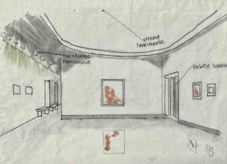
My last sketch was in the Weatherspoon Art Museum at UNCG. This space is very dramatically illuminated by a large clerestory many feet above the main open gallery area. Natural light floods into the space and illuminates the artwork and creates interesting shadows under the curved portion of the ceiling. Secondary lighting comes from recessed halogen lights in a corridor that leads to other galleries. This lighting is effective because it does not distract from the dramatic natural lighting effect, yet provides adequate lighting to travel along the corridor. More patterns of light and shadow could be introduced in the corridor to mirror the large clerestory in the main space. More subtle light comes in through the doors that lead to the outdoor courtyard, and inform the visitor that there is more to the museum outside. A highly polished concrete floor reflects the artwork displayed but does not cause glare due to natural light being used to light the space from a distance. This is a nice alternative to artificial gallery lights which may distort the colors in the paintings, and gives the visitor substantial yet unobstructive light by which to view the artwork.


No comments:
Post a Comment