Thursday, September 22, 2011

DC Speech Powerpoint Slide

While in Washington D.C., I visited the Freer and Sackler art galleries as well as the American Art Museum and Portrait Gallery. I decided to focus on the geometric division of light as seen in the courtyard in the American Art Museum and the stairwell of the Freer/Sackler Galleries. Both museums used natural light as an important feature, but to highlight different types of spaces (a circulation space and a gathering space). In the Freer/Sackler gallery, the light highlighted a piece of art where in the American Art Museum the light was the art itself (having a fluid, sculptural quality).

Wednesday, September 21, 2011

Blog Post 002: Photoshoppin'


http://www.ocmdbeachgirl.com/2010/06/fireworks-on-fourth.html

I experimented with photoshop for the first time with this blog assignment and it was a little harder than I expected it to be. I started with the picture below of the capitol building, then learned how to use layers to add the fireworks picture to the background. I then adjusted the light and color and voila! The top image was the result.  I'm excited to learn all about photoshop soon.

Tuesday, September 20, 2011

Reception Space Inspiration

http://www.turbosquid.com/3d-models/3d-model-reception-space/490120

I liked the use of lines in this reception space, which relates to my violin concept. I also liked the use of smooth material and the play of light & dark colors in the space.

Thursday, September 15, 2011

More Cool Chairs

With the absence of chair cards in my life this year, I took it upon myself to find some awesome chairs that spoke to me.


http://www.funcage.com/blog/13-of-the-coolest-chairs/
http://www.papermag.com/2009/04/eight_items_or_less_brooklyn_b.php
http://www.seasonalhomedecoration.com/cool-bright-chairs-nuance-by-casamania/
http://chairs-guidesntips.blogspot.com/2011/05/crazy-cool-chairs_23.html

Reception Space: Sketchup and Color Studies

Sketch of the floor plan


Sketch of the one-point perspective

Sketch of the two-point perspective


I decided that the warm color combination was the most successful color study because it most conveys the concept of a violin. 

Abstract Geometric Perpective: Violin

For this assignment, everyone in our class randomly picked a concept from a box, written down by someone in our class. My concept was violin. We were to create an abstract geometric perspective using this concept and the basic principles and elements of design. 


For my final two-point perspective, I decided on drawing long rectilinear forms inspired by the strings of a violin, and curved shapes inspired by the curves on the body of a violin. I explored material especially through the curved forms in trying to create the look of zebra wood used in some violins. 


D.C. Field Trip!

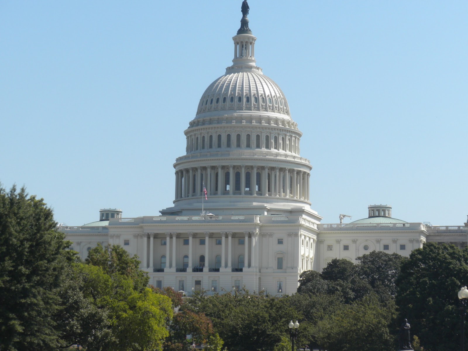
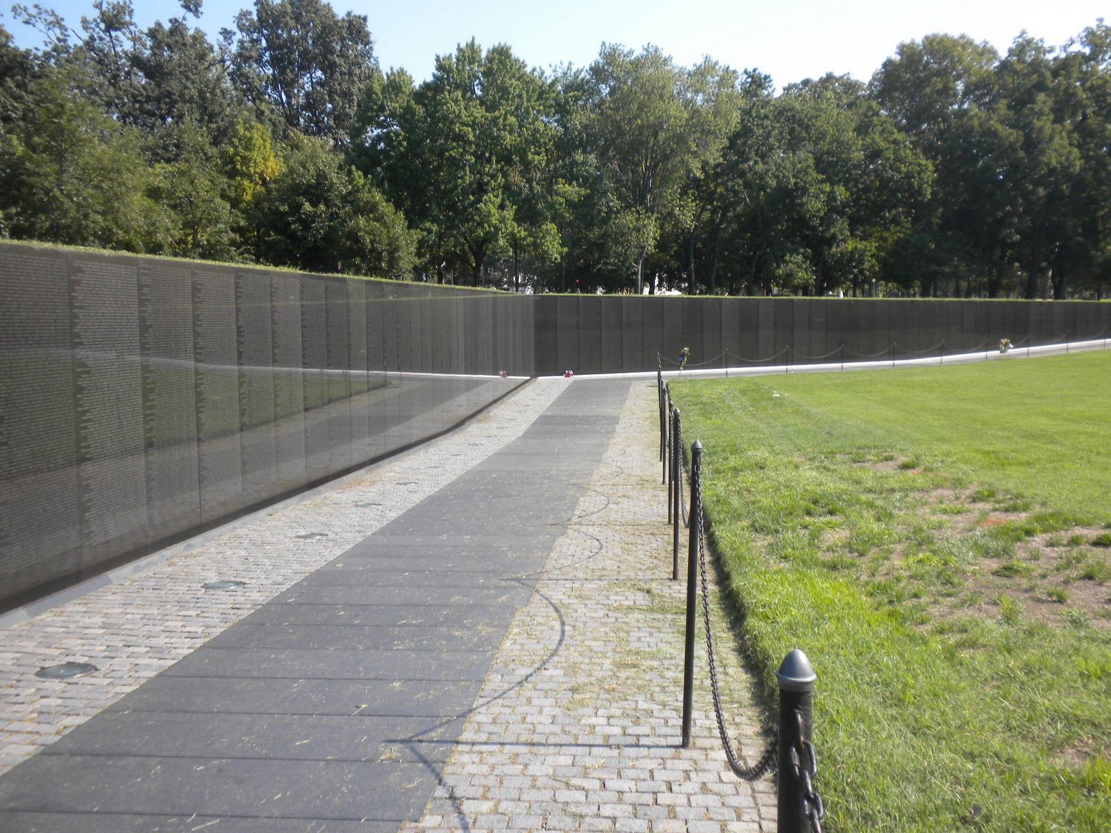
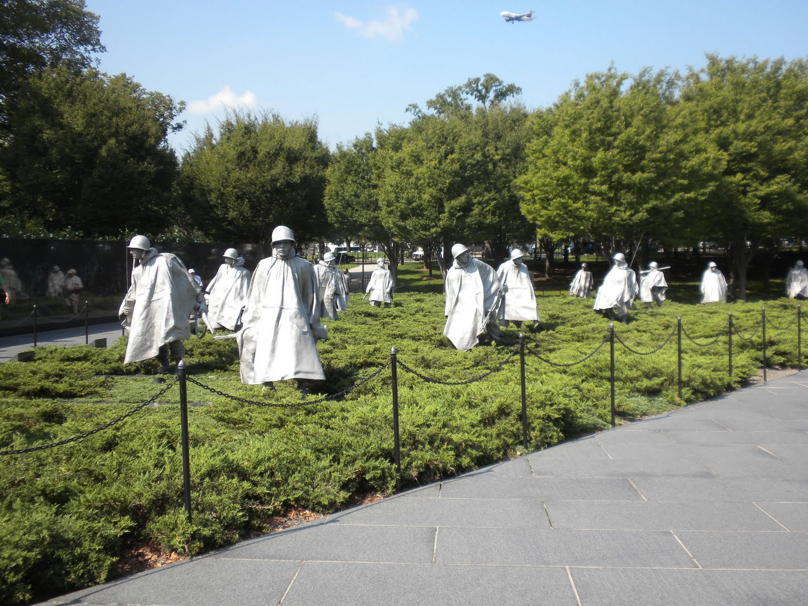
On Monday and Tuesday, our studio headed to the capital to see all of the great museums Washington D.C. has to offer. As a class, we divided and conquered 11 museums, each getting to visit 3. I visited the American Art Museum and Portrait Gallery, the Arthur M. Sackler Gallery, and the Freer Gallery of Art. We also visited the Library of Congress as a class, which was AMAZING. Here's a sneak peek of my experience in the district: