Thursday, October 13, 2011

Photoshop Compositions

For this composition, I first placed all of my images as different layers and scaled all of my images to the desired size. I then experimented with moving the images around until I decided on a layout. I used the text tool to title my composition and the line tool to create the "violin strings" as a border that I liked from my original composition. 

In this composition, I used the same process to scale and place my images, but decided on a different layout. I used the eyedropper tool to highlight the orange accent color in my perspective for the text and the lines. I decided on a more appropriate font for my violin concept that was more visually interesting. 

In my third composition, I scaled and placed my images in a way that gives more hierarchy to my perspective, by having my sections and plan to the right and my perspective framed by the border. I used the eyedropper tool to highlight my violin brown to use in my title and border. I kept the same script font from my second composition because I thought it was successful in conveying my concept.

Wednesday, October 12, 2011

Blog Post 004: Principles and Elements of Design


Rhythm: 
Rhythm is clearly present with the repeating geometric shapes we have explored. Rhythm is seen in the "triangle tree" trellis idea and the hexagonal shapes comprised of smaller triangles. We also explored rhythm with repeating square, circle and diamond shapes. Rhythm will be important with the installation of textures in the IOB as a means of way finding and keeping visually cohesive. 

Balance:
Symmetry has been created through patterns we have created, thus contributing to balance. In our display, we balanced larger elements with smaller models. In our space, we will use a similar method when combining large architectural pieces with smaller pieces. 

Emphasis:
We placed emphasis on shape, color, and texture in our presentation, but as a whole I believe our strongest emphasis is on the hexagonal pattern that we plan to incorporate in a large scale. 

Unity:
Unity is achieved through repeating geometric forms throughout the space. We also hope to achieve unity through a warm color scheme. 

Proportion:
Our overhang structure is dramatically scaled to create hierarchy using proportion. Smaller elements such as braille complement larger pieces going into the space. 

Line:
We have used very harsh lines and sharp angles to create a modern, industrial aesthetic. Softer lines are incorporated in wall fixtures and the overall trellis structure. 

Color:
We decided on a warm color scheme mixed with neutrals. We have 3 different color options that combine reds, oranges, browns, yellows, grays, and beiges.

Shape:
Geometric shapes such as hexagons, triangles, and circles have been used so far. We will be incorporating softer shapes such as circles to complement our design

Texture:
Texture has probably been the most important element thus far in designing a facility for the blind. We first used braille inspired textures to use as wall or floor coverings and then expanded to geometric textures. In our models we used textured paper, cardboard, styrofoam, plaster, metal wire, chip board, bamboo skewers, etc. to create and explore texture. Texture in our final project will be to direct users to focal points and highlight important areas. 

Form:
Geometric forms, especially triangles and hexagons have been a focus in this project. We have tried to incorporate softer forms with the use of curves in the trellis structure and other wall elements. 

Space:
Negative space is an important element in creating texture and shadow. Within the negative space in the hexagonal pattern 

Thursday, October 6, 2011

Inspired by Fallingwater

When I stumbled upon this "luxury villa" in Thailand, it reminded me a lot of Fallingwater. 

Here's the link to the website:

it's pretty awesome.

Tuesday, October 4, 2011

Dale Chihuly

I just discovered the sculptural glass works of Dale Chihuly and had to share. These are simply amazing.

http://www.seriousluxury.com/dale-chihuly/

http://twilightfromthecold.blogspot.com/2009/03/glass-art-from-dale-chihuly.html

This piece is from the ceiling of the Bellagio in Las Vegas:
http://www.royallyflushed.com/general/bellagio-glass-artist-dale-chihulys-work-on-exhibit-in-phoenix/

http://arrynvogan.wordpress.com/2011/02/17/artist-of-inspiration-dale-chihuly/

Sunday, October 2, 2011

Interior Lighting Effects

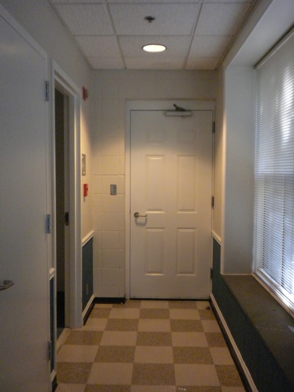
This is a photo of artificial light affecting the space; an overhead light casts a shadow from the chair onto the floor.

The elevator door in Tower Village suites is a vertical reflective surface.

A recessed light that causes a shadow above the door is another example of artificial light affecting a space.

This photo shows daylight entering a space.

A reflective floor surface shows the reflection of a table and chairs.

A mirror is an obvious reflective vertical surface.


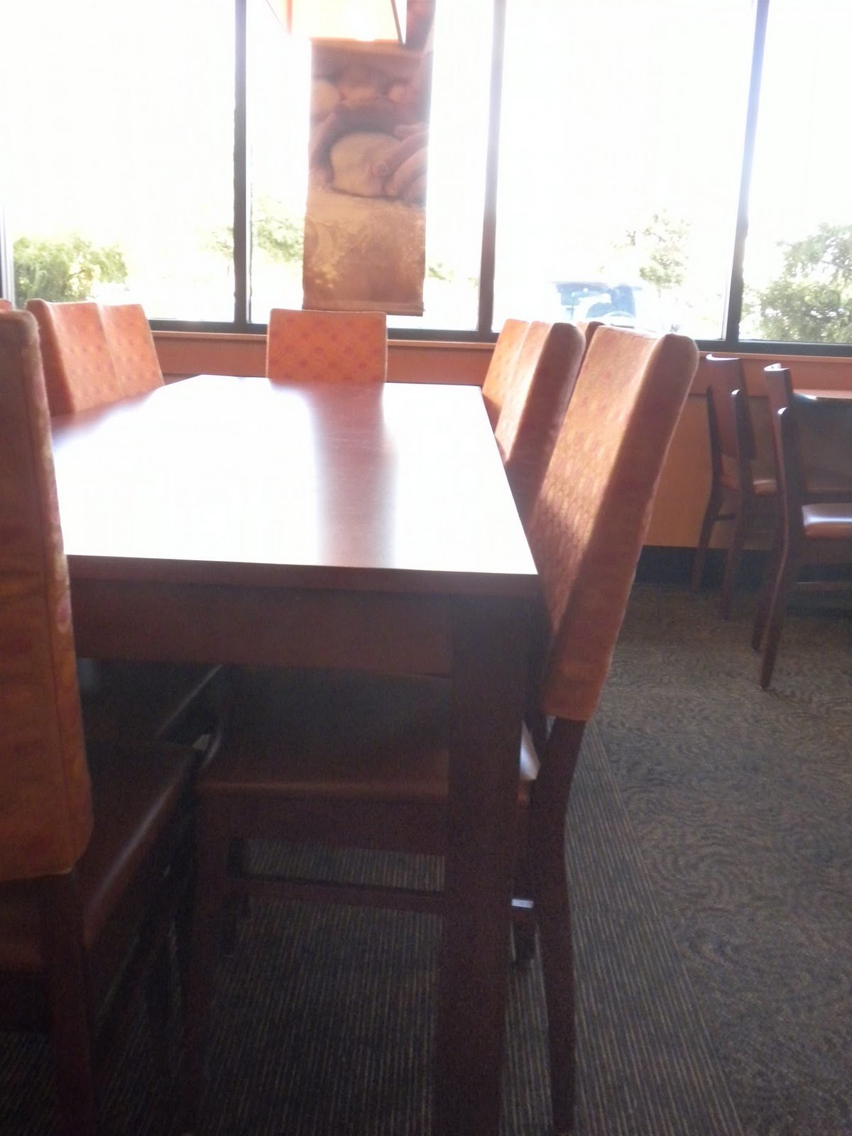
More natural light entering a space, onto a restaurant table.

Reflective floor surface in the Gatewood lobby.

Reception Space: Final Composition


Saturday, October 1, 2011

Successful Compositions


This composition was from landscape architect Janet Lee Coleman's website. It has clear hierarchy, the large colored plan on the right is commanding the most attention. This drawing also has the most value, which adds to the amount of attention given to it. She pulled colors from her rendering into the graphic on the left and her border, which is cohesive with the rest of the composition. I chose this composition because  I thought the border and graphics were successful in drawing attention to the drawings. 


Hierarchy is present with the size of the left image drawing more attention than the right images. High value is used in all of the computer renderings in an equal way which makes all of them read clearly.  The designer pulled color directly from the renderings into the background and border which makes for a cohesive look. I chose this composition because of the use of color in a successful way as well as the incorporation of information into the border.