Week 1:
-We explored exponentiality in design, as scale moving inward and outward from a point of central focus, Powers of Ten by Charles and Ray Eames illustrated concepts of perspective, relativity, interconnectivity, and how humans relate to their environment.
-We then explored Stonehenge and the pyramids at Giza. Stonehenge shows how architecture can be a symbol through its form (circular form has a meaning of equality). Stonehenge also shows the importance of light through indication of equinox and solstice. Pyramids have a strong upward arrow, shows five cardinal directions. Pyramids emphasized size and height.
Stonehenge
auburn.edu
Week 2:
-We identified three architectural elements that repeat themselves throughout architecture: circles, groves, and stacks.
-Circles: the sun and the moon. Circles mark sacred spots.
-Groves: trees, reaching vertical. Groves are like groups of people.
-Stacks: mountains and gathering resources. Stacks emulate the human body.
-Succession of prototypes: archetypes: hybrids in early examples of architecture show how certain types of structures came into existence.
-5 orders of architecture are seen in the evolution of columns: the Tuscan (prototype), Doric, Ionic, and Corinthian (archetype) and Composite (hybrid)
-Repetition of these basic design elements lead to contrast and emphasis, unity and harmony, balance and proportion.
Doric, Ionic, and Corinthian columns
chestofbooks.com
Week 3:
-The Acropolis in Greece served as our key example for archetypes of western architecture.
-Megaron served as a template for concepts of porch, court and hearth.
-Porch: Athena Nike, Court: area of Erectheon, Hearth: Parthenon
-Doric, Ionic and Corinthian columns are seen again to show distinction among the architecture, columns are another example of groves.
-Xi’an Palace in China and especially the Tomb of the First Emperor show strength through repetition. Sculptures were proportioned in stacks, armor in stacked form served as both protection and exhibit aesthetic quality.
-We analyzed space, power, experience, precedence, size, order, scale, technology and surface through the Xi’an Palace
-We explored the idea of real vs. ideal: Greece saw their empire as the center of the entire world.
-The Greek Theater was another example of circles, groves and stacks: Arena seating in a circular plan, benches and levels of seating were an example of stacking, and columns were once again seen as groves.
Acropolis
theodora.com
Week 4:
-The idea of commodity, firmness and delight was introduced (contrived from Vitruvius’s ideas of utilitas, firmitas, and venustas)
-commodity: the function factor in architecture
-firmness: strength of the structure
-delight: aesthetic, overall feeling and experience
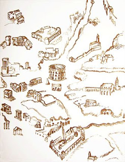
-We learned about the Roman Empire and their main ideas expressed in architecture.
-plan: cardo and decumanus: the city grid was a universal treatment of the empire
-road/street: all roads lead to Rome: every road led to the center of the city
-aqueduct: aqua vitae: very important because of the time and money spent by the government; Rome was destroyed by the destruction of aqueducts
-bath: architecture and ritual: façade is highly polychromatic and reflective (water), immense use of stone and tile, huge structure
-basilica: gathering place: long and designed to carry the speaker’s voice
-temple: adaptation
-arch: memorialization: marked important spots
-column: “wu wu”: marked important spots
-market: edge: away from government
-forum: major open space
-ampitheatre: atop a landscape rather than on it
-colosseum: bread and circuses: feed and entertain the people and they will stay


how do you see all this material connecting together?
ReplyDelete