Tuesday, December 7, 2010
2nd Year Studio Final Critique
I attended the 2nd year studio's final critique. Their project assignment was to design a structure by using a system of folding, experimenting with paper and origami as well as creating models and a presentation board. I thought two projects were especially successful. One project was a tunnel made out of angular plexiglass modules that was inspired by a human spine. This project was designed so the tunnel could change shape, and sections could be added or taken away. The model was very successful because it was made from a plastic or plexiglass material just like the proposed design and each piece was identical and well crafted. The scale figures were also effective in showing the tunnel's size and how people would interact with it, which was a big issue discussed in this critique. The graphics in this presentation showed the process very well, but with the final rendering being the prominent focus. Another project used a series of cardboard triangles that were folded and sewn together to make an adjustable tunnel where the user could modify the structure by folding it or changing the number of triangles. This model was also very well crafted and was demonstrated well with scale figures. The graphic presentation used a series of pictures showing the process like the first project. Overall, the second year students did a good job speaking clearly and articulating how they arrived at their final projects. I think they could have talked more about what exactly their project required and what their goals were.
Sketching over the semester
My drawing has improved significantly since the start of the semester. I used to consider myself as not being able to "draw" at all, but the practice I've done in my observational sketchbook has shown me than I can make successful drawings with the techniques I have learned. This semester I learned how to shade and blend effectively to create shadows and dimension and use erasing to show light. I have also improved on using detail and contrast to make more successful sketches.
I considered this to be my most successful sketch because the apple appears to be three-dimensional by use of shading and I believe I achieved to effect of light reflecting off of the apple.
Luminaire
The Final Project
Documentation
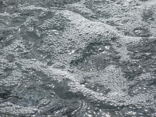
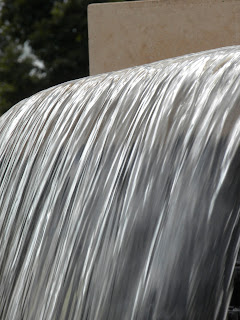
The inspiration for my luminaire was sunlight hitting the fountain outside of the dining hall. My original prototype used only canson and trace paper to make a curve structure that was similar to my original diagrammatic model in my light phenomenon presentation. I then changed direction to a less literal interpretation which used more interesting materials. I used drinking straws to filter the light as well as show the different levels of brightness and curves of the water in the fountain. I started out with reflective paper held up by wooden dowels as the back of my luminaire to reflect light onto the straws. Originally there was only one single row of straws that were attached with only a few holes drilled into the base, the straws being taped to each other. I found that the best way to create the fountain effect and appropriately filter the bulb was to drill two rows of holes all the way around the wooden base. I switched to using poplar wood instead of pine because it is harder and easier to work with on the drill press. I added a third row of straws in front of the bulb to make the light less harsh. Finally, I added feet to the base made from wooden dowels to lift my luminaire off of the table surface and to allow room for the cord underneath. After critique, I decided to use paper to further shade the light bulb which helped to further soften the light in the center of my luminaire.
First base with reflective paper backing
First wooden base with dowels
Original Prototype
Monday, November 15, 2010
Scale Figures
These scale figures were drawn in-class for about 2 minutes each. Both are contour figures.
1/2 inch scale
The gesture of the body in this figure is good, but the lines are a little sketchy.
1 inch scale
The lines in this scale figure are more defined, but some of the body could use work. I feel like I captured the silhouette of the head well.
Thursday, November 4, 2010
Light Precedents & Analysis
The diffused light from Lumicor's recycled glass resin panels reminded me of my fountain light effect because of their reflective quality as well as how the intensity of light varies vertically on the panels which is one of the effects I am trying to achieve. Glass bits could be a possible material.
lumicor.com
I researched ways to use corrugated plastic since that was one of the materials I purchased for this project. This example reminds me of the luminaire we were shown in class. I like that the area between the corrugation lines can vary based on how the plastic is cut, as seen below. The intensity of light is also seen to vary in this picture which is necessary for my project, so corrugated plastic as a material is still in the running.
grassrootsmodern.com
I considered using pleats as a way to translate the light effect of a fountain. These fixtures from Artemide diffuse light very beautifully and achieve a water ripple effect. I could use a technique similar to this with thicker vellum.
www.artemide.us
This wall light by Alesina Design was very similar to what I wanted to achieve with my luminaire. The ripple effect of the cut paper is very much like my light phenomenon, but perhaps I could find a more successful light effect for my project by projecting the light effect onto a wall in the opposite way that these fixtures.
Alesina Design also makes luminaires out of plastic drinking straws, which I thought to use to create my lighting effect. I thought these were interesting:
www.alesinadesign.com
Drinking straw lights from another company, Padlab.
www.padlab.com
Tuesday, November 2, 2010
Sketches
Our assignment is to choose a sketch from two people in our studio and describe which techniques they used that we want to adopt into our own process of sketching.
A sketch from Paige Hohlt:
I really like this sketch Paige did of her wood system project. I think what makes this sketch very successful is her skillful use of shading and perspective. She drew her straight lines very carefully which makes this sketch look very realistic.
A sketch from Pam Vidal:
What I like about Pam's light sketch is the way she captured the water beads on the water bottle. She also paid good attention to the contour of the water bottle itself. The shading under the curves in the bottle make her drawing look more three-dimensional.
My sketches:
This was my shaded twig sketch, I think my shading shows the twig dimension well.
The contour of this twig turned out well and I paid attention to a lot of the detail in the twig.
I think the shadow of this twig that had lichen turned out very interestingly.
Wednesday, October 27, 2010
Wood System
Our assignment was to cut a 2" x 4" x 18" section of wood at least five times, assembling the pieces into a connected system of parts and using every cut piece. The system was to maintain its form through joints that were created, using no wood glue or nails. My idea was inspired by a pyramid, where I cut notches into each 18" horizontal piece and attached ascending vertical pieces as the pyramid goes up.
top view
view from inside
close up of joints
early stages of assembling
Tuesday, October 26, 2010
Dan Flavin
Light is defined as "something that makes things visible or affords illumination". Light can go beyond the practical definition of making things visible by being the thing to be viewed itself. Light artists such as Dan Flavin explore the aesthetic properties of light, exploring color, form, and artistic ordering. Flavin's style is minimalist, using florescent rods of light to make interesting light effects. This style is very different from other artists such as Paul Friedlander, who captures morphous shapes in light sculptures such as "Timeless Universe" and "The Wave Factory". Flavin's linear style creates striking statements, as seen in the images below. I find the light display made for the Luis Vuitton window most interesting, the colors he used are very eye-catching and pleasing to look at, the use of glass and other reflective surfaces causes the eye to travel beyond the light rods themselves, and this particular work is multi-dimensional unlike some of Flavin's other works.
Other sources:
http://dictionary.reference.com
http://www.paulfriedlander.com/
This particular work was designed for a Luis Vuitton display in New York City.
Dan Flavin's "Untitled (To You, Heiner, With Admiration and Affection)" in the atrium of the National Gallery in Washington.
http://www.nytimes.com/2004/10/01/arts/design/01KIMM.html?_r=1
untitled (in honor of Harold Joachim) 3, 1977, by Dan Flavin
http://www.nytimes.com/2004/10/01/arts/design/01KIMM.html?_r=1
http://www.ressleart.com/past.htm
Other sources:
http://dictionary.reference.com
http://www.paulfriedlander.com/
Thursday, October 14, 2010
Light Through Water
I used a picture I took of a close-up shot of the fountain outside the dining hall around 1 p.m. I did a value drawing to show where the sunlight hit the water most directly as well as the darker areas caused by the area of shade underneath the cascade of water. In my model, canary trash paper shows how the concrete underneath the fountain is revealed subtly by the light through the waterfall. Black paper shows the darkest shadows directly above the reflecting line (cellophane), while vellum on top of white parchment illustrates how the water beneath the reflection of the sun is illuminated as the shadows become more and more concealed. The curve of the paper mimics the curve of the water in the fountain.
Thursday, October 7, 2010
Subscribe to:
Comments (Atom)


