Thursday, April 28, 2011

A Writer's Retreat

For our final project, our assignment was to redesign Saint Mary's House on Walker Avenue into a Writer's Retreat for visiting scholars of UNCG's MFA Creative Writing Program. The building was to function as both a semester to year-long living space for a visiting writer as well as a place to hold public readings and meet with students. 

My space is cottage inspired, creating a cozy environment for a writer to write as well as keeping with the historic feel of the building. I achieved this through the use of beams to visually lower the high ceilings as well as softer chandelier and lamp lighting. The furniture also keeps with this more traditional style. As you enter the building, you step into a foyer space with a built-in bench seat so if there is a public reading happening, it will not be disturbed if people arrive late. This can also serve as a place of reflection or preparation for the writer before readings. To the right of the foyer I included the public bathroom that was away from the main public space.  Through the public reading space drawn below is a conference room to meet with students that is separated by sliding panels, so more space can be created for a public reading if need be. Behind the conference area is a semi-private living room and kitchen, and a bookshelf-lined hallway leading to a private office. Across from the office is a private bathroom, and adjacent to the office is the bedroom. One of my main goals in designing the space was to establish an intimacy gradient that would fit the needs of the writer and make living more comfortable. 

Perspective of the Public Reading Space

Perspective of the Office

Perspective of the Bedroom

Plan

Longitudinal and Transverse Sections

Model of Saint Mary's House that my group built


Unit Summary 3

At the beginning of the 20th century, World's Fairs were hubs for sharing and displaying ideas and new designs and are an example of "thinking out loud".  As time went on, World’s Fairs went from being called “fair” to festival, exhibition, exposition, and expo. Their purpose was to be commemorative, commercial, collaborative, and celebratory in terms of design.  The World’s Fairs were very significant because they introduced designs such as the Eiffel Tower, the automobile, and the ferris wheel.  The global influence was evident as people traveled to the fairs, they brought back new ways of seeing as well as new products and ideas that influenced everyday life.

            Looking back at the 19th century, design was categorized by reform that brought about the Arts & Crafts movement. Designers were in discourse about whether hand craft or machine was a better method of design, and arts & crafts believed and popularized the hand-crafted practice. William Morris was a chief practitioner of arts & crafts and believed it was a way of reviving the medieval world. Perhaps the most well known architect of all time was a designer of the arts & crafts style, Frank Lloyd Wright, who designed hand-crafted furnishings for his unique homes in this style. Wright’s holistic approach to design defined his career as an architect of the arts & crafts movement.
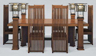
Wright's Dining Room Table for the Robie House

            The Art Nouveau period spanned from the 1880s into the 1920s and was an aesthetic movement that emphasized fluid, curving lines reminiscent of the baroque style and used surface materials such as ceramics, glass and tile. Designers like Antonio Gaudi draw inspiration from human bones/skin and stalks/stems in their work, such as the Segrada Familia. Industrial aesthetic and exposed mechanical systems were also elements of art nouveau, like Wagner’s Postal Savings Bank, emphasizing the beauty in the “stem” rather than the “flower”.  Art Deco, the counterpart to Art Nouveau, used platonic forms and circle motifs, as well as playful, polychromatic schemes such as the Miami Beach Hotels.
Segrada Familia

An Art Deco Miami Beach Hotel
                               

Into the mid-20th century, many designers came up with their own versions of modernism. Charles Le Corbusier experimented with concrete as a form, such as the Notre Dame DuHaut, and Ludwig Mies Van der Rohe experimented with glass, like the Edith Farnsworth House. Out of this modernist work came a sub-genre of “internationalism”, meaning that no matter where in the world a building is located, they all look the same. This is mainly true with modernist skyscrapers such as Mies Van der Rohe’s Seagram Building. However modernism became known to place form over function, viewing buildings as art over habitable spaces. Philip Johnson said, “comfort is not a function of beauty”, and as a result of this thinking, many modernist buildings could not meet the functions they were intended for or had to be changed to fit human needs.
Seagram Building

            The interior decorating industry was born in the early to mid 20th century as upper class housewives decorated their own homes, which became popular and allowed them to give decorating advice and services to other households. Elsie de Wolfe was a pioneer in interior decorating and was famous for revamping Victorian spaces by removing heavy ornamentation. Syrie Maughm was another early decorator who made mixing period styles popular.
room by Elsie de Wolfe

room by Syrie Maugham
        

Scandinavian architecture embodied the metaphors of the businesses they were designed for.  For example, Som’s U.S. Air Force Academy Chapel was inspired by the flight of a plane wing, and this gesture is evident in the design.  Respectively, The Scandinavian pair of Roche & Dinkeloo’s design of the College Life Insurance Building pushed the metaphor of an afterlife.  Scandinavian design is a brand of modernism all its own and is still seen around the world.
U.S. Air Force Academy Chapel
College Life Insurance Building


Monday, April 25, 2011

Blog Post 14: Top Picks

For my top object I picked Bath & Body Works PocketBac Hand Sanitizer & holder.  Being a germophobe, I love that I can always have hand sanitizer on hand in my favorite Bath & Body Works fragrances. The holder is designed perfectly to attach to my backpack, keys, and purse, and I love that they come in different colors-- even glitter and glow in the dark! I must not be the only one who finds the PocketBac collection genius because I can hardly go anywhere on campus without seeing these attached to people's bags.


My top space is this Manhattan apartment space by architects Hariri & Hariri that I came across while flipping through Architectural Digest one day. Ever since I have been in love with it. I love the use of clean lines and low furniture to emphasizes the stunning city view as well as the use of lighting and materials to create a very posh, elegant, yet modern feel. 


For my top building I picked Biltmore Estate. When I visited Biltmore a few years ago, I was amazed at the sheer volume of space inside and the grandeur of the design inside of the building. The influence French architecture in North Carolina is intriguing and the high-tech design methods used for its time is fascinating.


My top place is historic Charleston, South Carolina. Old Charleston is the epitome of southern charm and the history of its buildings and culture is so rich. You feel like you are in a different world when you are there. This atmosphere is inviting and evokes summertime and a slower pace of living. 


Monday, April 18, 2011

Extra Credit: Eames vs. Design Star Philosophy

Charles and Ray Eames devoted their lives to design; their philosophy was highly based on human needs and solving problems they saw in the world.  Their legacy continues in the Eames studio, especially with the design of office furniture. The “Design Star” philosophy, basing on HGTV’s reality show “Design Star” is very different, with a strong emphasis on “do it yourself” projects and a belief that anyone can be a “Design Star” regardless if they have had formal design training or experience. Not to say that the Eames approach is right and the Design Star approach is wrong, but the factors of education, credentials, experience, and certain skill sets have an influential role in various projects.

Although some people are born with a very good eye and talent for design, education refines these talents and allows people who aren’t as gifted at first to get experience and growth in learning how to design effectively. Being in Iarc, I have been pushed out of my comfort zone as far as design and have gotten lots of useful feedback from my professors that I otherwise would not have gotten if I had become a freelance designer with no formal education. Not to mention education is very valuable to many employers in the design field. Credentials and experience are also important traits in a designer entering the field.  A designer who is LEED or ASID certified might make more money, attract a larger client base, and get to do a larger range of projects than someone who has not become certified in areas such as these. A designer who has designed many types of spaces for a broad range of clients is more adept to executing design projects based on their experience. A holistic approach to design, such as the works of Frank Lloyd Wright, can be a plus to a client or employer. By taking all elements of design into consideration, a space tends to be more cohesive and may work better for the user of the object, space or building. As far as life skills, those who have had experience in certain areas or have visited certain places can draw inspiration from these events, such as previous jobs or trips.  The Design Stars are usually very young and may not have the experience or life skills necessary to provide a knowledgeable design. Lastly, media plays a major role in interior design today. With shows on HGTV and the DIY network, design is portrayed as something everyone is capable of producing. This is somewhat deceiving since certain tools and skills are usually needed to achieve these designs.  Also stores like Target advertise products from well-known designers, making good design accessible to all. I believe today’s world is more interested in design than ever before, everyone wants to be a designer, but factors such as education and experience play a crucial role in the field.


Blog Post 13: Scandinavian Design Legacy

Scandinavian modern design has shaped the architecture, interiors, and consumer society of America and around the world. Today in stores like Target and IKEA, simple minimalistic-designed products are mass produced for everyday people at a low cost. Scandinavian design tends to be beautiful, modern, simplistic, and highly functioning.

For example, this "Henriksdal" dining chair from the IKEA website is mass produced in a variety of finishes and upholstery and is very affordable for the average household, ranging from about $60-$100. They are very simple and have clean lines, with no ornamental flourishes, the focus being on the commodity of the chair. Because of its low cost, accessibility, functionality, and beauty as a dining chair in a variety of interiors, this type of chair is seen throughout many retailers and in many homes. In fact, the dining chairs in my house are just like these chairs. Modern design for the masses is the legacy of Scandinavian design. 

Thursday, April 14, 2011

Reading Response 13


Sources:

Roth, Understanding Architecture

http://www.tufts.edu/alumni/magazine/winter2008/images/features/photo_meierstent.jpg

http://www.hauteliving.com/2011/02/art-on-display-top-5-art-galleries-in-atlanta/

http://www.archicentral.com/wp-content/images/28.jpg&imgrefurl=http://www.archicentral.com/extension-to-the-high-museum-of-art-atlanta-usa-renzo-piano-2896/&usg=__yCDO3yVOUIrFwJUaxMtLf3MY2Q0=&h=523&w=795&sz=151&hl=en&start=15&zoom=1&tbnid=4BQ3Li8hWrSjrM:&tbnh=145&tbnw=204&ei=DcyrTcjYB8ry0gG00pz5CA&prev=/search%3Fq%3Dhigh%2Bart%2Bmuseum%2Batlanta%26hl%3Den%26client%3Dsafari%26sa%3DX%26rls%3Den%26biw%3D1212%26bih%3D635%26tbm%3Disch0%2C403&itbs=1&iact=hc&vpx=715&vpy=238&dur=389&hovh=182&hovw=277&tx=124&ty=75&oei=ncqrTfnLDcrx0gH0m-H5CA&page=2&ndsp=15&ved=1t:429,r:3,s:15&biw=1212&bih=635

Tuesday, April 12, 2011

Dining Space: Final Compositions & Model

Our assignment was to design a dining space to host a biannual celebration for International Eradicating Hunger Day in 2015, coinciding with the summer and winter solstices. We were told to incorporate social media to include guests from other parts of the world. The requirement was to design a table, sideboard, and space that will facilitate celebration over food for 4-10 people with international connection via social media. 

I chose to design my space in a New York City apartment. Social media was incorporated through my dining table via a screen that would rise out of 2 glass panels in the base, allowing the dinner party to video chat and have dinner with people all around the world. I used translucent and reflective elements such as the ghost chairs and glass chandelier so when lighting is changed from warm to cool in the summer and winter solstices, it will be captured in these surfaces. I also included a balcony with a glass railing that another screen could be projected out of, allowing the dinner party to go outside and view a fireworks show as part of the celebration while having after-dinner drinks or dessert and still being able to communicate with the international guests. I tried to maximize space in the room by having built-in banquette seating and a built-in sideboard. 

Perspective, Elevation of table area, Social Interaction diagram, Axon, and plan

Dining Table Orthographics

Sideboard Orthographics, Dining Chair selection, and Materials

Model

Back view of the model, showing the proposed balcony

Monday, April 11, 2011

Blog Post 12: Good Design for All

Something that I believe represents "good design for all" is the Brita water pitcher. These pitchers purify tap water instantly through a small filter enclosing small carbon pellets, forcing the water into a reservoir at the top, so when it is poured out of the spout and into your glass, there is no mercury copper, or chlorine in your water. These pitchers are like having a water filtration plant in your refrigerator, and they are very inexpensive (about $30) and never need to be replaced, only new filters need to be bought every 2 months that cost about $5 each. The low cost of these pitchers and filters make them accessible to just about every household, college dorm room, or office, which is a key factor in the pitchers being a good design for all. One of the best reasons these pitchers are a good design is because it solves the problem of using plastic water bottles that end up in landfills, which promotes sustainability.

The pitchers are not only highly functional, economical, and eco-friendly, but they come in a range of sizes and design styles, to compliment any kitchen's style or color scheme. Aesthetics as well and function make the Brita pitchers objects of "good design".

Source:
http://www.brita.com/products/water-pitchers/

Sunday, April 10, 2011

Reading Response 12


Sources:
Ching, A Global History of Architecture
http://www.movemodern.com/mm/images/stories/random/eames_house.jpg
http://www.ryrussoyoung.com/wp-content/uploads/2011/03/steel_6_eames.jpg
http://www.mariabuszek.com/ucd/ContemporaryArt/Images/Exam2/EamesHouse.jpg

Thursday, April 7, 2011

Unit Summary 2

In 400-800 CE, temples such as the pyramids at Giza, the Parthenon, and Pantheon surfaced and took on an architectural style of their own, making a statement about religion. These structures used materials such as glass and stone as expressions of faith, with stone carvings depicting religious beliefs and glass that “dematerialized” the facades of religious buildings and let in light. Light was seen as evoking God himself, so the presence of light in these temples was very important. The quote by Thomas Fuller, “Light, God’s eldest daughter, is a principal beauty in a building” explains this thinking because architects at this time were expected to design structures that were both beautiful and a reflection of God, which then in turn reflected the church. The heavy ornamentation on these buildings such as stone carvings and intricate mosaics causes the eye to “dance” across the surface, catching the light and the stories they tell.  The idea of architecture as “frozen music” was also a main idea in the design of these buildings. The chanting and hymns of church choirs were reverberated from the vaulted ceilings of cathedrals.
            As the first millennium ends, we begin to see many examples of the modern world map and how people at this time perceived the world. Many maps were drawn in circular form, and groves and stacks were also repeated as ways to reference surrounding areas.  Strong religious implications were also seen in maps such as the Mappa Mundi of the 13th century with Christ’s head, hands, and feet as a compass. The layout of churches of this time period follow a similar cruciform shape, indicating the body of Christ, such as Notre Dame. These thoughtful and intricate maps indicate a more enlightened society, rejecting notions of the “dark ages”.
            Moving away from the gothic movement and into the renaissance brought about design rules reflected in both the east and the west. In the western world, there is a strong link to ancient influences such as the Parthenon, Colosseum, and Pantheon. These precedents combated design ideas from the dark ages to break the gothic mold in expanding the physical world.  The east also continued ideas from the past, carrying out elements from ancient worship centers and pagodas, such as the Shwezigon Pagoda of the 11th century, into later architecture.  Strong spiritual connections were emphasized in the east to expand the inner world. These design rules were made to eventually be broken in both the west and the east with the carrying out of the renaissance.
            Now that western design rules have been written down, the renaissance came into full swing as rules were bent and broken.  New rules came into place as a result of this change, like Andrea Palladio’s rulebook of architecture modeled after Vitruvius.  Palladio’s influence was seen through architecture that now stretched horizontally, such as the Palazzo Del Te, instead of the strong vertical emphasis adopted by gothic buildings.  Certain baroque elements were incorporated into architecture as a result of the renaissance.  The first design element to come into play was fluidity, which is characteristic of baroque architecture. For example, the curved staircase of Chateau Fountainbleu, moving to full-blown ornate baroque spaces such as Versailles. In the east, designers kept up a continuous approach to architecture, having no specific reform to the rules of the 14th and 15th century like the baroque movement of the west.
            Colonial expansion characterized architecture of the 17th century, which brought ideas and people around the world.  The idea of apartments or townhouses became popular in France with Place de Vosgues, individual houses that are connected together, which was a link to suburbs.  The enlightenment connected with baroque architecture through an understanding of history, engineering, logic, and changing with the industrial revolution.  Architecture emulated the baroque style but the focus changed to forms that embodied this new logical mindset, like the Greenwich Observatory.
            From 1700-1800 CE, revolution in political, social, and cultural realms brought revolution in design.  We see rules continue to be made and broken as a part of a perpetual design cycle. With the American Revolution and Reconstruction, new styles of buildings were invented such as the hall and parlor house plan of the Parson Capen house in Massachusetts. Revival becomes a main aspect in revolutionary design. We see Greek rules for Architecture throughout much of the South, through porticos on plantation houses like Drayton Hall in Charleston and Greek columns in state government buildings such as the North Carolina State Capitol.  Invention takes the main stage through architecture to showcase new ideas, like The Great Exhibition of 1851 in Hyde Park, London.
            The main idea surrounding this unit is rule making and rule breaking. Reverberation categorizes the unit by echoing ideas of the past and re-emitting new rules and ideas to be changed again.


The nautilus shell represents the outward spiral of the design movements explored in this unit.

Tuesday, April 5, 2011

Blog Post 11: Modernism & Design

The early 20th century invention that changed the world perhaps the most was the automobile. This was a time when modernism was on the rise an everything was about being better, innovative, more advanced. Modernism appealed and still appeals to the masses because of the human desire to be better than everyone else and to have the newest, cutting edge designs "of the future". We tend to appreciate forward thinking...it is impressive to us to see something no else else has done or thought of before when it comes to design. Like the Ford Model T, Henry Ford's first car that became available to much of America in the early 20th century, cars of the present day exemplify modernism with sleek, sporty forms like the new 2012 Porsche Carrera, as well as features that are becoming standard in more economical cars, like gps and bluetooth technologies, touch start, and hybrid cars.


Sources: 

http://www.autonewstoday.biz/2011/01/22/2012-porsche-carrera/

http://www.google.com/imgres?imgurl=http://aes-humanities8.wikispaces.com/file/view/model-t.gif/31606141/model-t.gif&imgrefurl=http://aes-humanities8.wikispaces.com/Henry%2BFord%2Band%2Bthe%2BAssembly%2BLine&usg=__H45EErwLdmhLWg-QE22TlApKmhc=&h=269&w=389&sz=28&hl=en&start=0&zoom=1&tbnid=bQuR_dKlu_iUqM:&tbnh=162&tbnw=210&ei=3OybTbvoCo24twfX-L20Bw&prev=/search%3Fq%3Dhenry%2Bford%2Bmodel%2Bt%26hl%3Den%26client%3Dsafari%26sa%3DX%26rls%3Den%26biw%3D1440%26bih%3D704%26tbm%3Disch&itbs=1&iact=hc&vpx=747&vpy=146&dur=1480&hovh=187&hovw=270&tx=164&ty=95&oei=3OybTbvoCo24twfX-L20Bw&page=1&ndsp=18&ved=1t:429,r:3,s:0

A Whole New Mind: Design Website Reviews

In A Whole New Mind, the author urges us as designers to read design magazines or blogs to "sharpen your eye and inspire your mind".  In my design process, finding precedents online and in design blogs inspires me and always gives me new ideas on ways I can create something that is cohesive, stylish and well designed. Here are a few I find interesting and inspiring:


Yanko Design
Yanko Design is a web magazine that features modern international design. It includes technology, interior design, industrial design, architecture, fashion etc., but looking through the website I see a strong emphasis on product design and technology, focusing on the latest and greatest gadgets. Most of the featured items of the week include everyday items that optimize function and convenience. When I see this site I am constantly thinking "ooh I wish I had one of those..."
This week, Yanko Design features a very interesting interview with Karim Rashid that is very much worth reading.
http://www.yankodesign.com/

Design Sponge
Design Sponge focuses much more on interior design with an emphasis on home living with sections such as "DIY", "Before & After" and "Recipes".  This blog really helps the everyday person create a stylish space in their own style. The blog creates groupings of furniture, textiles, fashion, and color palettes for the reader that all correspond with the same style, which really make it easy for a person who may not know that much about design or certain styles to pick a look that they like and know how to make it happen through color, furnishings and other entourage in a space.
http://www.designspongeonline.com/

Apartment Therapy
Apartment Therapy focuses on design for small spaces, something that young adults and students like me can relate to. With the motto "Saving the world, one room at a time", Apartment therapy helps urbanites and yuppies make their otherwise drab living spaces into well designed ones with a defined style. The website uses precedents from major cities (New York, Los Angeles, Chicago, etc.) to inspire readers with other well-designed small spaces. Tabs at the top of the main page such as "cooking" and "green" also appeal to the home living interests.
http://www.apartmenttherapy.com/

Monticello & Fallingwater (extra credit)

I was intrigued by the design of both Monticello and Fallingwater but the most fascinating to me was definitely Fallingwater.  Just by being built over a waterfall made viewing the house absolutely breathtaking. The cantilevered design allowed the views from inside the house to be completely unobstructed and gave the house its very modern appearance. One of my favorite elements was all of the stone Frank Lloyd Wright used in the house, connecting the house to its setting in nature. Knowing that almost all of the interior elements were designed by Wright and getting to view them was an amazing experience, and I appreciated how well everything tied in with the house itself.  I enjoyed all of the history of Monticello and thoughtfulness Thomas Jefferson put into the home, but Fallingwater was my favorite because of its beautiful, detailed, and modern design.

here is a rough sketch of the main floor of the house:

Saturday, April 2, 2011

Reading Response 11


Sources:
Ching, A Global History of Architecture
http://www.gamblehouse.org